Taking time with visualisation
Line chart
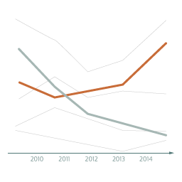
What it shows
A line chart connects plotted points against horizontal and vertical scales, then uses lines to join the points together. Line charts are often used to show changes over time, with the x axis representing time. Sometimes only one set of connected values is plotted, shown with a single line. However, several different groups may be plotted on the same chart, shown with different lines. A line chart might be used to show the monthly (x axis) average temperatures (y axis) for several cities around the world (different coloured lines on the chart).
How to read it
First, look at the axes to understand what the chart is showing. Then examine the chart to see the values of the points in the lines. Follow the lines and see if there are any trends, sudden rises or falls, repeating patterns, or places where lines cross each other. It might also be possible to see emerging patterns and to predict where the lines might go in the future.
Things to beware
Line charts don’t always need to start at zero, as they are used to show changes in one category rather than to compare the sizes of different categories. However, the y axis should start at zero if it has critical significance in the interpretation of the trends. Be aware that the upwards and downwards trends on a line chart can seem more significant if the chart width is narrow, or less significant if it is stretched out. Avoid jumping to conclusions if you see two lines following a similar pattern, it doesn’t necessarily mean that one thing has caused the other, it might just be coincidence.
Alternative
Bar charts can also be used to show how values look over time. They tend to be used when the focus of the chart is on the absolute values at each point in time, rather than on the trends of connected up and down patterns that a line chart portrays.