How Social Semiotics Can Help Us Understand Big Data Visualisations
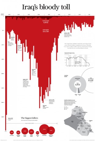
Blood drips thickly from a timeline, spilling down the page under the heading ‘Iraq’s Bloody Toll’. This powerful visualisation was published in the South China Morning Post, providing a visceral and emotive comment on civilian deaths in the war in Iraq. Before we read any of the text or figures on the page we know exactly what the message is: too many deaths in Iraq.

How is such a vivid and immediate impression made? How do visualisations tell specific stories about data? Data visualisations aren’t just about data, they are about art too. Visualisation professionals use colours, fonts, positioning, visual metaphor and other elements to communicate particular messages about the data. To understand how such elements are being used and how immediate impressions are made we need to undertake analysis of the visualisations. The analytical approach we are using is social semiotics.
Social semiotics is a systematic approach to visual analysis. It is a two-step process of identifying the modes (individual components like colour or font) and then assessing what the cultural meanings of the modes are. We then need to do the same for other big data visualisations so that we can identify the semiotic resources being used in all visualisations. When it comes to analysing Iraq’s Bloody Toll, therefore, we need to look at as many big data visualisations as possible to see how different modes are being used and what is similar and different between them. This will give us an inventory of the semiotic resources that are used in the production of big data visualisations, and this will help us to understand how meaning is created.
In ‘Iraq’s Bloody Toll’ a number of modes build up to create the shock of the image: the bar chart is inverted so that the bars hang below the line; the ends of the bars are rounded rather than square; there are no gaps or lines between the bars, creating a mass of red; the red is blood red and contrasts with the darker red for coalition deaths. All of these together give the impression of blood dripping down the page, especially as the title, ‘Iraq’s bloody toll’, refers to blood and the word ‘toll’, which suggests ‘death toll’. Together these modes communicate the message that the number of civilian deaths in Iraq is far too high. This is a distinctly different message to that of military discourse about ‘collateral damage’, where the euphemism hides the fact that people are dying.
Iraq’s Bloody Toll uses some of the same semiotic resources as other data visualisations: the clearly labelled x and y scales; the precise figures and dates; and the indication of the source of the data. These resources connote transparency and verifiability and thereby tell us that this data visualisation is authoritative and an honest reflection of the data. The power of Iraq’s Bloody Toll, however, comes from not using some of the semiotic resources other visualisations use. For instance, the lines between bars are missing and the ends of the bars are rounded, both of which make it more difficult to read the data precisely. Meanwhile the colour of the bars is very emotive. Iraq’s Bloody Toll is designed to look like blood pouring down the page. Where other visualisations, like ‘The Global Flow of People’, use colour to achieve an appearance of neutrality and of letting the data ‘stand for itself’, ‘Iraq’s Bloody Toll’ wants to evoke an emotional response in the reader.
This example shows the power of social semiotics in decoding how messages are communicated by data visualisations. On the Seeing Data project we are only at the beginning of our analyses and we are excited to be using this powerful approach to gain insights about big data visualisations.
Further reading
- Aiello, G. 2006. Theoretical Advances in Critical Visual Analysis:
Perception, Ideology, Mythologies, and Social Semiotics.
Journal of Visual Literacy. 26(2), pp.89-102. - Barthes, R. et al. 2009. Mythologies. Rev. Vintage ed. / with an introduction by Neil Badmington ;
‘Astrology’ translated by Siân Reynolds. ed. London: Vintage. - Van Leeuwen, T. 2005. Introducing social semiotics. London: Routledge.
