Innovative Datavis in the News

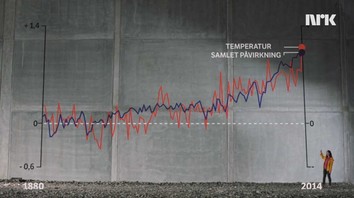
Data visualisation has for some time been an integral part of visual storytelling in the press (e.g. Gynnild 2013). With new digital tools available in the newsrooms, infographics and data visualisations on news sites have taken new dynamic and interactive forms (e.g. Cairo 2013). The use of data visualisation in journalism may lead to a more facts-based news discourse combining intelligible presentations of big data with fascinating visual forms. It also bears promise of a shift in the interactional patterns characterising the discourse, as many data visualisations invite – or demand – active exploration by the audience members.
The aim of Innovative Data Visualisation in the News is to describe the current status and the future prospects of datavis in Norwegian news media, building on both theoretical and empirical investigation, including international comparison. As such, the project will benefit other researchers in the field as well as datavis designers, news media leaders and visually oriented journalists.
The research questions are:
- What is the status of innovative (dynamic and/or interactive) datavis in major Norwegian news sites today? What is the extent of use, what characterizes their forms and what roles do they play in the discourse in which they appear?
- What are the views of leading actors in major Norwegian news organizations regarding the current and future roles of datavis in the news genres?
- How does the situation in Norway compare to the situation in the UK with regards to questions 1 and 2?
- What characterizes the processes of production and distribution of innovative datavis in a major news organization like NRK?
- How are innovative datavis offered by a major Norwegian news organization like NRK understood and used by the online news audience?
- What factors have the strongest impact on the efficiency of datavis in the context of online news media – including all aspects of the communication process?
