Innovative Data Visualisation in the News: update on progress
What is the current status of data visualisation in the news? What do they look like? How are they designed and produced? What discursive work do they perform? And how are they read? These questions are at stake in the project Innovative Data Visualisation in the News, funded by the Norwegian Media Authorities and conducted by researchers from University of Agder (Norway) and University of Sheffield. The focus is on Norwegian news media, with data from Scandinavian and British media used for comparison.
What is the project about?
Data of various kinds are becoming more and more accessible, and both journalists and news readers are becoming aware of their news value potential. There are lots of good news stories buried in statistics concerning crime, traffic, weather, economy, social services etc, if you know how to select, analyse and visualise them. The other factor is technology. Developments in software make it ever easier to handle and transform numeric tables and other forms of digitally stored data into readable visual forms like diagrams, charts, graphs and maps.
Most people know how to read a simple bar graph, used in a news story to provide evidence for a journalistic argument or to make a complex story more comprehensible. But what about more complex diagrams or graphs that move and change forms? What about interactive visualisations, where you need to make your own choices and give the system an input to make it respond? How are these innovative visual forms used, read and interpreted? And what part do they play in the development of modern, digital journalism? Does it become more grounded and fact based? More aesthetically attractive? Or maybe more manipulative and insisting?
In this project we have chosen three approaches to answer these questions:
- Qualitative interviews with news room leaders and with designers and programmers
- Close reading of selected data visualisations, based on social semiotics
- User studies, involving observations and interviews with news readers
What have we done so far?
During this spring, we have completed 24 interviews with news room leaders and designers of data visualisations in 10 major news organisations in Norway, Denmark and Sweden. We have visited national broadcasters and “paper-based” news houses serving both national and regional audiences. We have also carried out an interview with the founder of a successful software company in Norway, offering a broad menu of tools for integrating diagrams and graphs in news stories (or elsewhere). We have also started to select and analyse the material that will be subject to social semiotic analysis.
What do we ask our interviewees?
The conversations we have with news room leaders are somewhat differently structured than those we have with designers and programmers. While the first are focused on strategic thinking, journalistic goals and long term developments, the others are more concerned with detailed preferences, work flow issues and all the choices made in the design and production processes. But both groups are asked about ethical considerations and practices (for example, concerning source treatment and transparency), their views on readers’ visualisation literacy and their assumptions concerning future developments and trends.
Some preliminary impressions
At the time of writing, the interviews are being transcribed, so they are not yet analysed. But after having talked to 24 practitioners in the field, we can identify some areas of particular interest. One of these is the issue of platform. Although the different organisations are in somewhat different stages of development with regard to their visualisation production, it seems obvious that the ethos of “mobile first” represents a powerful framework for the development of data visualisations on news sites. If it does not work on mobile, it is not produced at all, more or less. This “rule” has consequences for the format of the visualisations, the density of information in the design and the way designers think about interactivity (asking themselves, for example, what can you do with your thumb?). It also seems evident that consciousness concerning active “involvement” with data is high among the designers. That is, they’re aware that a visualisation is never an objective reflection of the world, but a product of many choices made in the process of selection and production. “I think we are more careful with how we use and present the data than many of those who make information campaigns for the government,” one informant said.
Next steps
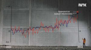
The project is still in an early stage, and there are lots of remaining steps to be taken. In the coming autumn, interviews will be conducted in the UK, in order to supplement the Scandinavian material. It will be interesting to see if the situation is similar across countries, or if specific differences will be revealed. Also more text analysis will be done in the autumn, as will the user study. How do readers react to the kind of graphic presentations such as the image shown above and seen here: https://seeingdata.org/innovative-datavis-news/? Then, eventually, and hopefully, a number of papers and articles will surface from the project. So stay tuned!