by Helen Kennedy
• July, 24th 2014

Over several periods from 2007 to 2009, I lived and worked in northern Mexico and the US-Mexico borderlands–particularly around the cities of Juarez and El Paso. As a social scientist interested in movement and borders, I found that time to be hugely formative in helping me understand how migration was central to everyday life. So,continue reading »
by Helen Kennedy
• July, 15th 2014

In my other research I work on popular music. To be specific, fan experiences. I was fascinated, therefore, by Google’s Music Timeline which at first glance I thought showed the popularity of various genres over time (1950-2010). How exciting to be able to see trends in fandom, I thought. Taking a quick look at thecontinue reading »
by Helen Kennedy
• July, 7th 2014
In many ways we are in a golden age of experimentation and discovery in data visualisation. The popular coverage of data visualisation on the web tends to reflect this, generally concentrating on new projects, new techniques and tools. This is entirely understandable. Greater degrees of discourse about some of the key nuances of visualisation designcontinue reading »
by Helen Kennedy
• June, 28th 2014

I recently gave a keynote speech and set a project brief about the Seeing Data project at the Digital Methods Initiative (DMI) Summer School in Amsterdam. The DMI has been ‘re-working method for Internet research’ since 2007, but its foundations stretch back beyond that, to the publication in 2000 of the collection of essays Preferredcontinue reading »
by Helen Kennedy
• June, 20th 2014
In the social sciences, data can come in many different forms. Census data, interview transcripts, survey results, statistical outputs–these are just some examples of data that social scientists regularly generate, collect, and analyse for a wide range of questions about society. Visualising results, or depicting findings via visual means such as charts and tables, hascontinue reading »
by Helen Kennedy
• June, 19th 2014
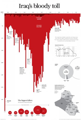
Blood drips thickly from a timeline, spilling down the page under the heading ‘Iraq’s Bloody Toll’. This powerful visualisation was published in the South China Morning Post, providing a visceral and emotive comment on civilian deaths in the war in Iraq. Before we read any of the text or figures on the page we know exactlycontinue reading »