Visualising Life at the US-Mexico Border
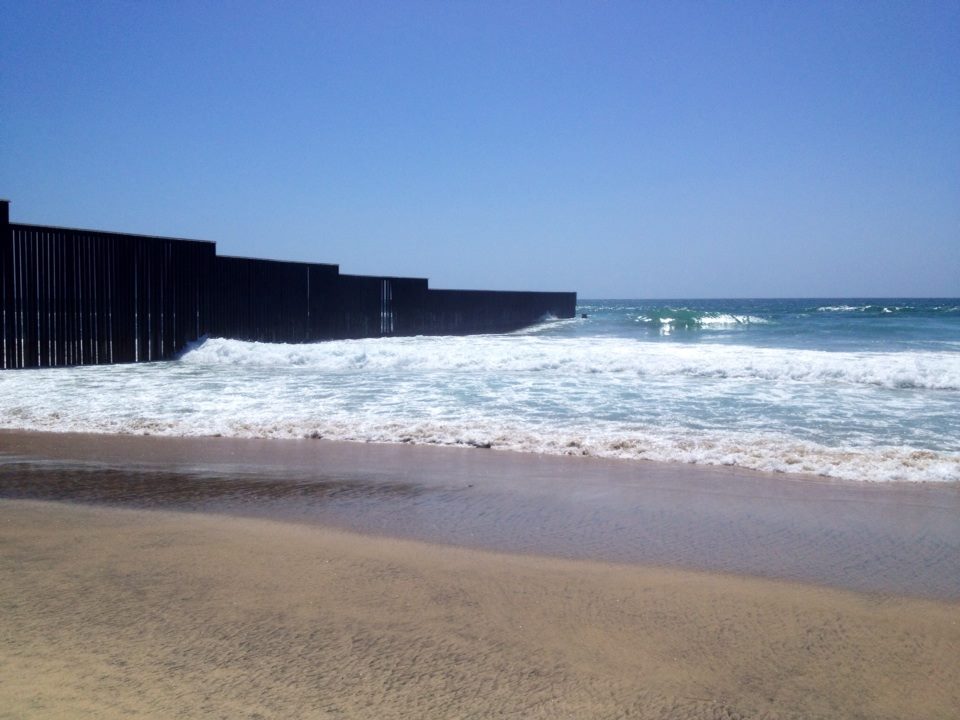
Over several periods from 2007 to 2009, I lived and worked in northern Mexico and the US-Mexico borderlands–particularly around the cities of Juarez and El Paso. As a social scientist interested in movement and borders, I found that time to be hugely formative in helping me understand how migration was central to everyday life.
So, when National Public Radio (NPR) recently published a visualisation/photojournalism hybrid website titled Borderland with the tagline ‘we took a 2,428-mile road trip along the Mexico border: here’s what we saw’, I immediately dove in. Presented as a full-screen series of slides, Borderland captures different parts of life along the US-Mexico border through various lenses. Some are individual stories of migrants, while others feature statistics and historical facts about how the border developed. Although perhaps not strictly a visualisation in any traditional sense, to me there are several elements within it which illustrate three important aspects of visualisation.
Interest in the Subject Matter
What caused me to click on the link in the first place? Frankly, it was because I knew some part of the subject matter. Having lived in these border towns, I was keen to see how they were represented in the story as it was visually presented. The organisational structure hinted at in the tagline (reporting on what was seen along a ‘road trip’) suggested that we would experience a series of stories drawn from many different border locations—a promise that the visualisation delivers.
Surprise/Shock/Revelation
But, despite having prior knowledge of life in these borderlands, there were still opportunities for surprise, shock, and even revelation. For example, bookending the visualisation slides are two continuously updating counters that inform the user of what has happened at the border during the time spent on the website. Seeing these statistics about the number of pedestrians, vehicles, detentions and, perhaps worryingly, the amount of marijuana and cocaine intercepted at the border provide extra insight by quantifying—in simulated real time—these important aspects of border life. Yet, these rolling numbers also contribute to a very specific (and some might say selective) picture of ‘everyday’ life at the border.
Physical Sensation
Alongside these moments of insight, I was also struck by the physical sensation of repetitively clicking through the slides in a linear fashion. (There is the option to display all of the stories by clicking on a menu button in the lower left-hand corner). Much like a road trip with a destination in mind, this visualisation unfolds in a mostly linear fashion: a numbered series of stories roll past the screen like snapshot scenes past a bus window. It feels like a planned journey rather than a bird’s eye view ripe for exploration. By the twelfth story, one may even feel tired like after a long journey.
While Borderland includes other journalistic elements such as photographs and quotes, I think it usefully brings up these issues of prior experience, surprise or insight, and physical feelings which can also be applied to other visualisation types. A full analysis of how visualisations are received and perceived, like the kind included in the Seeing Data project, should also incorporate these elements.
Further Reading
Rippberger, Susan J., and Kathleen A. Staudt. Pledging Allegiance: Learning Nationalism at the El Paso-Juarez Border. Psychology Press, 2003.
Heyman, Josiah. “Constructing a “Perfect” Wall: Race, Class, and Citizenship in US-Mexico Border Policing.” Migration in the 21st Century: Political Economy and Ethnography. Pauline Gardiner Barber and Winnie Lem, eds (2012): 153-174.