Recognising the intent of a visualisation
The challenge of enhancing visualisation literacy is not just concerned with being able to comprehend a wider variety of charts and graphs. It is also about having greater sophistication to recognise what outcomes certain visualisations are attempting to accomplish and indeed what they are capable of accomplishing.
We will soon be undertaking a series of focus group events involving participants experiencing a variety of different visualisation examples. We will be assessing their experiences to discover things like how well they have understood, how they have felt and what they have learnt from the works they have been exposed to.
One of the discussion points I am most intrigued to learn about involves the expectations people have about the intent of different visualisations.
In my visualisation teaching I frame some of the initial design discussions around the importance of establishing ‘tone’ as one of the key dimensions of intent. Tone concerns the type of experience you are trying to facilitate with your visualisation and the intended outcome you hope to achieve. In certain contexts there will be a desire to facilitate the ‘reading’ of data, whereas in others there will be greater emphasis on the outcome of ‘feeling’ data.
Reading data
Some visualisations are primarily attempting to help viewers resolve the magnitude of values as accurately as possible. This is about enabling the reading of data. We are not talking about the type of immediate readability a table of values provides, rather a set of representation choices that are proven to facilitate accuracy in interpretation whilst still providing a graphical portrayal to reveal patterns. For example, generations of studies (from Bertin, through Cleveland & McGill to Mackinlay) have revealed that showing the size of values through the length of a bar or the position of a mark along an axis will aid the desire for precise reading of represented values.
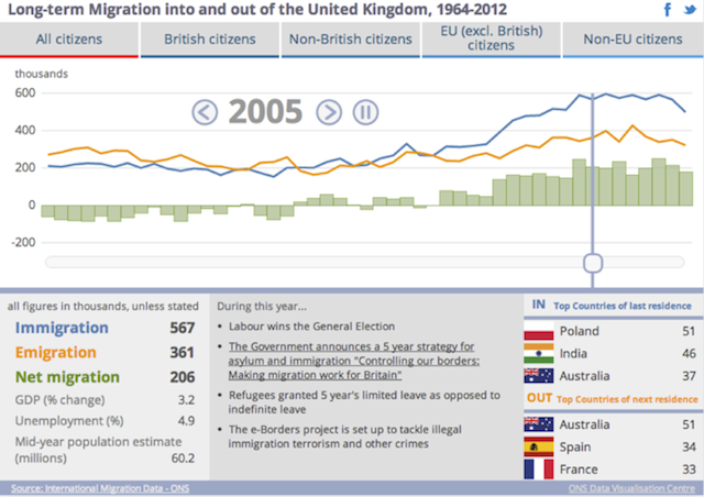
This tone is demonstrated by the graphic below, the style is analytical in nature, it is about clarity and efficiency of interpretation. Coming from the UK Office for National Statistics it is necessarily free from emotion to preserve objectivity. The ambition of its intent is to inform: not about persuasion, not something that leads to Hollywood style decisions, just simply to inform the key facts and trends about long-term migration in/out of the UK. It is up to the viewer to decide how they will react given their own unique reasons for consuming this information.
Feeling data
Sometimes the complexity, size and nature of our data means the best visual portrayals are simply incapable of facilitating easy reading of values. It is not about making readability harder through unnecessary distortion or decoration (such as gratuitous 3D) it is about recognising that some charts and graphs are only aiming to accomplish a portrayal of the big picture – the ‘gist‘.
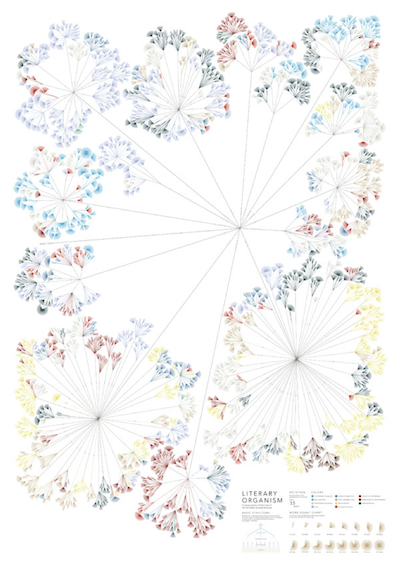
The graphic below, created by Stefanie Posavec, visually portrays the word counts, structures and themes in part one of Jack Karouac’s novel “On the Road”. It is not meant to be a statistical treatment of these attributes, rather an elegant visual overview of the entire content of the dataset. You can glide across the surface of this presented analysis, noticing the main branches, the dominant colour patterns, the long chapters, the short chapters. Can you tell how many words were in the 4th paragraph of section 2 in chapter 10? Not really, that’s not its intent. For that kind of experience you would need an entirely different type and tone of visualisation. Will a viewer without the experience of interpreting this type of visualisation know that it doesn’t facilitate value reading? Will they be able to relax into the experience of just being able to see a bigger picture view?
Feeling and Reading
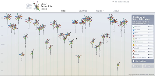
Going beyond demonstrating just one of these tonal extremes of ‘reading’ or ‘feeling’, some visualisations combine the two. The OECD’s ‘Better Life Index‘ is an example of a project that brings to life Ben Schneiderman’s visual information seeking mantra: ‘overview first, zoom and filter, details on demand’. The first view seduces the audience into the project, presenting quality of life measures as petals to form attractive country by country statistical flower displays. The petals provide an overview – once again, a gist – of the general quality of life across the 34 countries. One cannot easily and accurately read the values portrayed by the petals – the design metaphor of the flowers is in some ways at the sacrifice of precise readability. However, as an interactive work, the project is able to supplement this initial overview portrayal with a more detailed – more readable – bar chart version at the click of a button.
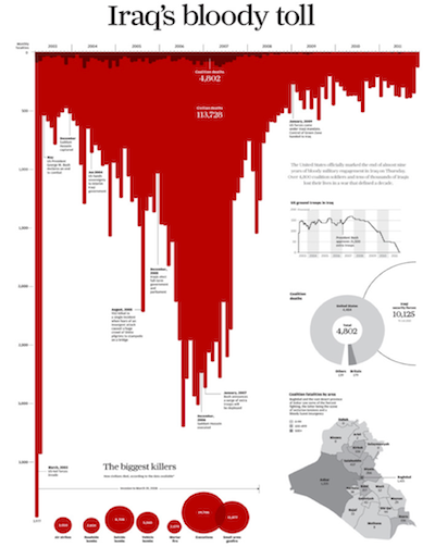
Sometimes the intent is to provide both the readability of data points and a collective emotive experience in the same view. As Rosey has discussed in a previous posting, Simon Scarr’s ‘Iraq’s Bloody Conflict‘ delivers both a bar chart from which you read the individual values and an overall effect that is striking in its emotional impact.
Further reading
- “Graphical Perception: Theory, Experimentation, and Application to the Development of Graphical Methods”, William S. Cleveland & Robert McGill (pdf)
- “Automating the Design of Graphical Presentations of Relational Information”, Jock Mackinlay (pdf)
- “The Eyes Have It: A Task by Data Type Taxonomy for Information Visualizations”, Ben Shneiderman (pdf)