Talking to people about visualisations
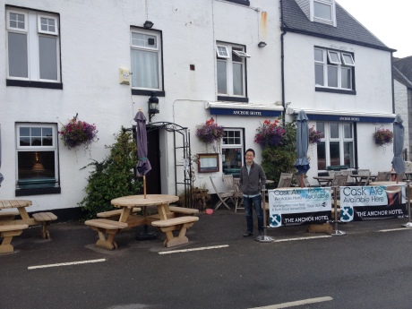
Over the last couple of months Will Allen and I have been going around the country talking to various groups of people about their encounters with data visualisations (conducting focus groups). Some of the people we’ve spoken to have been particularly interested in data and data visualisation, but a lot of people have not: they are what we might call ‘non-specialists’. We have met people who are interested in open data, others who are art lovers, some who are involved in civil society work, some who have direct experience of migration, others are involved in agriculture and still more work in library settings. We have travelled to Lincolnshire and Scotland, and we have met people in Bradford, Leeds and Oxford too.

In these focus groups we have talked to people about the diaries they’ve kept for a week before the focus group. They have recorded all the data visualisations that they’ve encountered and told us where they saw them, how long they looked at them, what they felt and what they learnt from them. After discussing the diary keeping we have asked people to look through some visualisations that we have chosen for them, in order, but in their own time. And then we’ve come back together as a group to talk about them in detail, asking questions about which ones they liked, which subject matters engaged them, which ones were most difficult to use, some of the things they learned. We also asked them about whether they trusted the visualisations and the factors behind these feelings of dis/trust. Finally we asked them to think more generally about data visualisations and what kinds of skills are needed to ‘read’ them.
At this point I can’t tell you all our findings – there are still a couple of focus groups to do and we haven’t got into the analysis yet – but I do want to say that we are getting a fascinating snapshot of the kinds of things people think about visualisations, migration and the other subject matters in the visualisations. There is a very diverse range of opinions about what infographics and visualisations should ‘do’ and about how they should be made. We are starting to see some agreement about what things non-specialists want to see in a visualisation (a clear title being a popular one), but in general, the roles of our participants(in employment or leisure) seem to determine how they view the purpose of visualisations and how much time and interest they have to engage with them.
Helen and I will be talking more about our findings at the European Communication Research and Education Association next week, although this will be based on our first impressions, not our formal analyses. If you’re there come and say hello.
We will soon begin the next stage of the empirical research – the extended diary keeping. Through this we hope to gain a better sense of what kinds of visualisations people see in their daily media use and how they fit in to their everyday lives.
