The Challenge of Visualising Qualitative Data: can a Venn diagram help us to understand the place of sociocultural factors in engaging with visualisations?
On the Seeing Data project we have generated a lot of data for qualitative analysis: we have focus group and interview transcripts; written diaries; talking mat representations of how much people liked and learned from visualisations; semiotic coding of visualisations. Lots of very rich data which we are busy analysing. One thing that has become clear to us as we have been thinking about the data and about the wider context of visualisations, is that visualisations are most likely to visualise quantitative data. How, then, to visualise our qualitative data, retaining its beautiful complexity, contradiction and ambiguity without reducing it to quantities? And what would we gain from doing so?
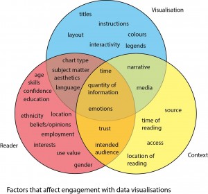
I’ve been experimenting with using a Venn diagram to understand the kinds of statements that our participants used to talk about their engagements with visualisations. Our original categorisation of the things that affect engagement (arising from focus group and interview transcripts and diaries) was:
 social and cultural factors around what individuals bring to engaging with a visualisation;
- the context of engagement;
- the visualisation itself.
These are not entirely discrete categories; there is overlap. My original Venn diagram takes these groups of factors as three sets and looks like this (see right):
Each person’s encounter with a visualisation is affected by a combination of the factors in the sets in the Venn. Factors can relate to just one thing (e.g. a particular visualisation is useful for your work) or can be a combination (the chart type may be one you’ve seen before and so you can understand it quickly). How can this Venn help us to understand our qualitative data, and how useful is it for visualising the information in a way that makes sense?
Here are two examples of our participants’ engagement with the Better Life Index by OECD. They include what the participants said about the visualisations, demographic information from questionnaires and details about the focus group in which they saw the visualisation:
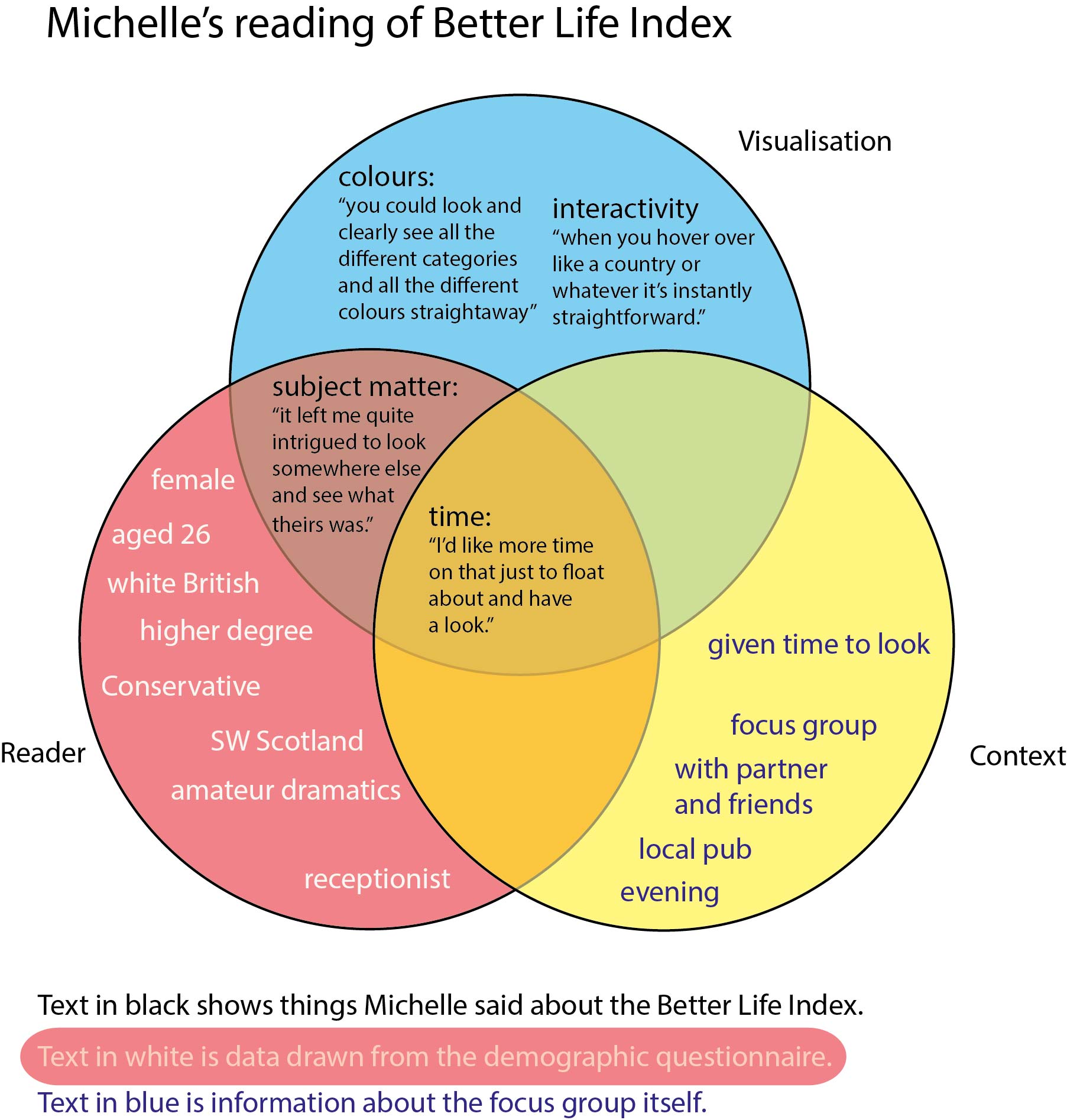
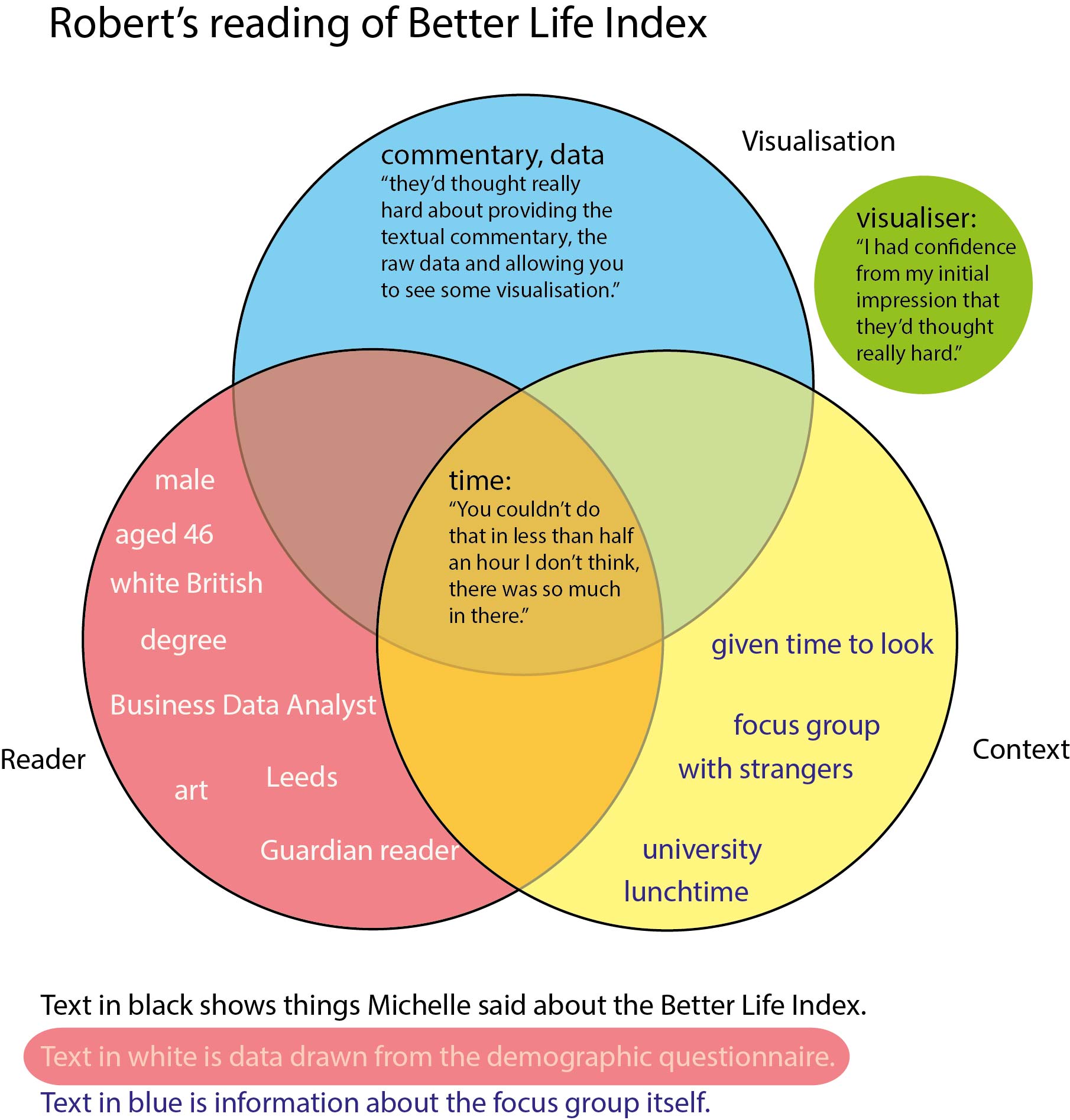
Both Michelle and Robert liked the visualisation. Michelle valued the clarity of the categories and the way the colours enabled her to quickly understand what was being represented – this is about the visualisation as a visual text. Robert commented on the text too: he felt that the ‘textual commentary’ and ‘raw data’ had been thought hard about and presented well. But Robert’s comments extend to imagining the process of the visualisation. Possibly his job as a data analyst gave him a sense of the kind of work needed to produce visualisations.
Both wished they could have spent more time looking – but is time a straightforwardly contextual factor? Time limited their engagement with the visualisation, but for others, such as Tom, there was no desire to look further. Tom wanted an ‘essential message’. Time was not a contextual factor for him.
So although both Michelle and Robert liked the Better Life Index, they liked it for different reasons that brought together their own interests and the visualisation itself. For Michelle it was a combination of the subject matter of the visualisation and the ease with which she was able to navigate it; for Robert, ‘first impressions count’ and his confidence in the way the data had been treated was what drew him in and sparked his desire to look for longer.
Putting the qualitative data into a Venn diagram brings to the fore the different ways in which people engage with visualisations: the visualisation itself is a big part of their engagement, but their responses to it are affected by different socio-cultural factors. The Venn allows comparison between different reading encounters. As it stands, the visualisation designer is absent from the Venn, although some people (such as Robert) did mention them. Should the designer be included as a fourth set? Is there enough room in each Venn to visualise all of the relevant quotations? There is a risk that with limited space quotes will have to be reduced to their most salient points – losing some of their richness. One other limitation is that each single encounter requires a Venn, so its time and space consuming.
Nevertheless I think the Venn offers potential for bringing complex data together in a visual way, helps us to analyse our findings and, perhaps with development, it could provide an interesting way to communicate our research. So far this is just an experiment so we would value any feedback (constructive!) – drop us a line at seeingdata@leeds.ac.uk.