Visualising Text as Data
Yesterday, a PhD student and I launched a new report with the Migration Observatory that analysed the language used by the UK national press to talk about Bulgarians and Romanians since December 2012. Textual analysis, as well as the visual representation of that analysis, is a topic that has really captured my interest because of the challenges in dealing with something that is so nuanced and complex. Language as it occurs in any genre can be difficult to systematically crack, but especially when it comes in ‘messy’ or non-standard forms like tweets or online comments. Even in newsprint journalism and Parliamentary policymaking where texts are relatively well-formatted and clearly organised, the task of showing how meanings differ or change is fraught with difficulty. This can be compounded when the subject matter, in this case international labour migration from a key set of countries, is controversial and politically charged.
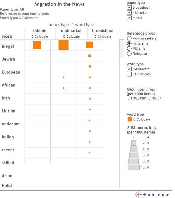
In August 2013, when the Migration Observatory launched its first report looking at the language used to describe immigrants, migrants, refugees, asylum seekers over a longer three year period, we also released an interactive chart. It enabled users to dig into the linguistic analysis along different dimensions—which kind of publication (tabloids or broadsheets for example), which migrant group to study (such as ‘immigrants’ or ‘refugees’), and how large of a window around each mention to include (although this was an either-or choice between one word to the left or five words on either side). This visualisation, along with many others on the Observatory’s website, was generated using Tableau Public. Our aim, aligned with the Observatory’s mission to inform migration debates by providing data where possible, was to be as transparent and clear as possible about the analysis–as well as the conclusions derived from it.
As Andy discussed in his previous blog post, visualisations can be categorised along a dimension of reading versus feeling. When designers want to emphasise accuracy and enable users to pick out individual values, possibly to achieve a degree of objectivity, they may turn to visualisations that include elements such as lines and bars which are easily interpreted. Conversely, when designers are more concerned with providing an overall sense of data rather than particular values, they may turn to visualisations that tap into emotions, aesthetics, or metaphors. Crucially, it is important to note that this binary division is for illustration: many visualisations actually lie somewhere between these two poles, depending on their purpose, original research questions, or audience.
But these qualities of ‘reading’ and ‘feeling’ visualisations are helpful to social scientists, especially those concerned with communicating their research to wider audiences, as they try to improve their own practice. Our initial visualisation of patterns which emerged from the textual data would fall closer to the ‘reading’ end of the scale: by selecting which dimensions they want to see, as well as hovering over the squares attached to each word, users can quickly see precise values for comparison. On the one hand, this is helpful for illustrating the salience of phrases like ‘illegal immigrants’ and ‘failed asylum seekers’—which were the most common ways that UK national newspapers described each group respectively. Yet on the other hand, it arguably does not communicate the degree of sentiment associated with these kinds of words. While our original project did not set out to measure the tone of words used in connection with different migrant groups, this is a dimension of analysis that other scholars in migration and political studies are very interested in exploring. Doing so through visual means seems to be of vital importance.
Further Reading
Blinder, Scott and William Allen, Constructing Immigrants: Portrayals of Migrant Groups in British Newspapers, 2010-2012. Centre on Migration, Policy, and Society: University of Oxford, (2014), WP-14-117.
Costas Gabrielatos, and Paul Baker, ‘Fleeing, Sneaking, Flooding: A Corpus Analysis of Discursive Constructions of Refugees and Asylum Seekers in the UK Press, 1996-2005’, Journal of English Linguistics, 36/1 (2008), pp.5-38.
Alexandria J. Innes, ‘When the Threatened Become the Threat: The Construction of Asylum Seekers in British Media Narratives’, International Relations, 24/4 (2010), pp.456-77.