What is a visualisation?
Data visualisation aims to help people make sense of and explore data. Experts believe that the visual representation of data through visualization can help communicate data, as well as allowing people the opportunity to analyse and examine large datasets which would otherwise be difficult to understand. For many people visualisations are a helpful way to make sense of the growing quantity of data that surrounds us. Data visualization does this by combing aspects from art (creativity, or designing communications that work on an aesthetic level and survive in the mind on an emotional one) and science (exploiting the way our eyes and brains process information).
Below are some examples of data visualisations that are circulating today. This is just a small sample from many hundreds, to give a taste of what visualisations might look like, and what types of data they represent. To learn more about the latest developments in data visualisation, and to access up-to-date examples and discussion relating to visualisation, visit Seeing Data researcher Andy Kirk’s company blog Visualising Data. Here you will also find links to useful resources, including data visualisation tools, data sites and recommended books. The site also contains an archive of monthly collections, showing the best in data visualisation projects, articles and field developments back to February 2010.
Literary organism
#8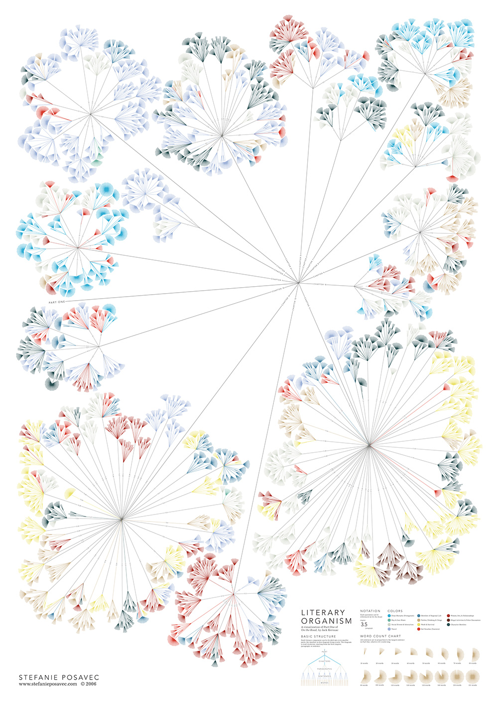
Part of a ‘Writing Without Words’ MA project exploring methods of visually-representing text and the differences in writing styles between authors. This printed work portrays the book On the Road, by Jack Kerouac.
Stefanie Posavec view original
The pursuit of faster
#7
To mark the London 2012 Olympic Games, the Pursuit of Faster data visualisation project explores the evolution of male and female medal winning performances across all Olympic Games since 1896. It portrays the patterns of improvements in the results of time-based events where speed is the measure of success, whether it be on foot, in water or on water.
Andy Kirk and Andrew Witherley view original
Giving voices to the vulnerable: the economic crisis
#6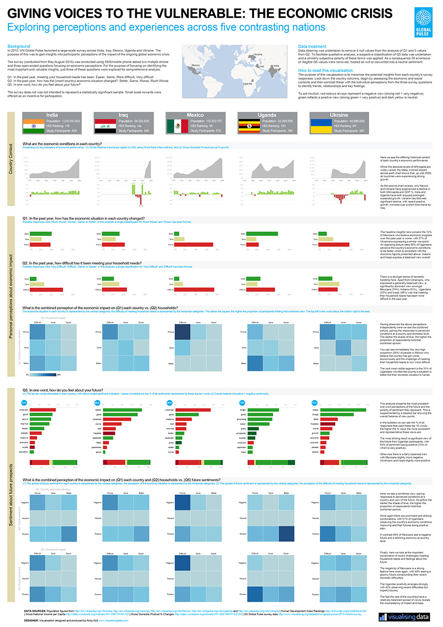
Printed infographic visually exploring key insights from a 2011 UN Global Pulse survey into attitudes of participants in five key countries affected by the economic crisis.
Andy Kirk view original
Weather chart
#5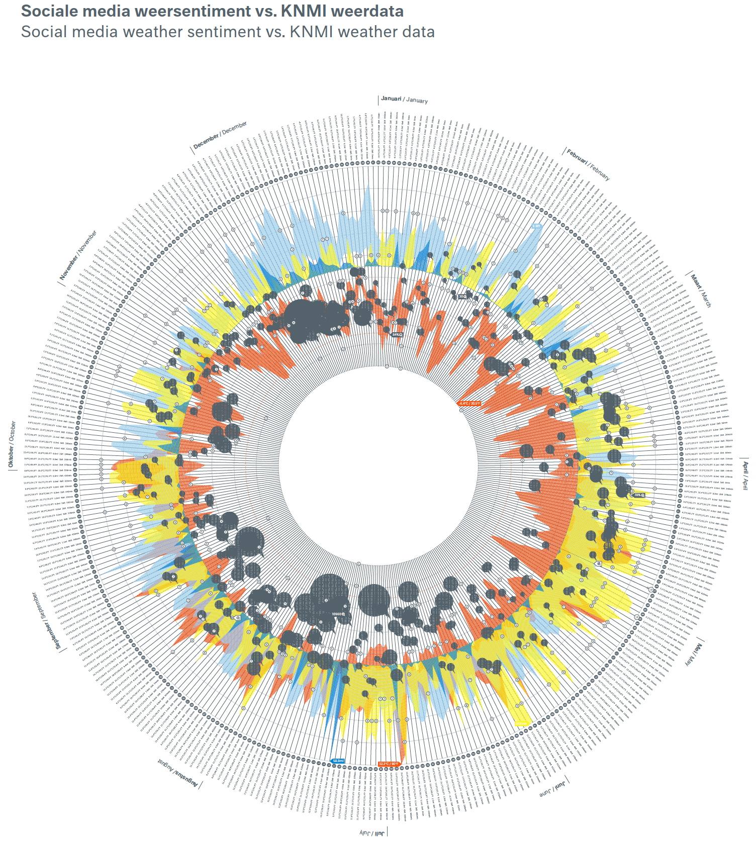
Printed poster-sized infographic exploring various aspects of weather patterns across the globe, including maps of weather extremes and global ranking of countries based on average temperature (between 1962 – 2012).
Clever Franke view original
Long-term migration into and out of the United Kingdom
#4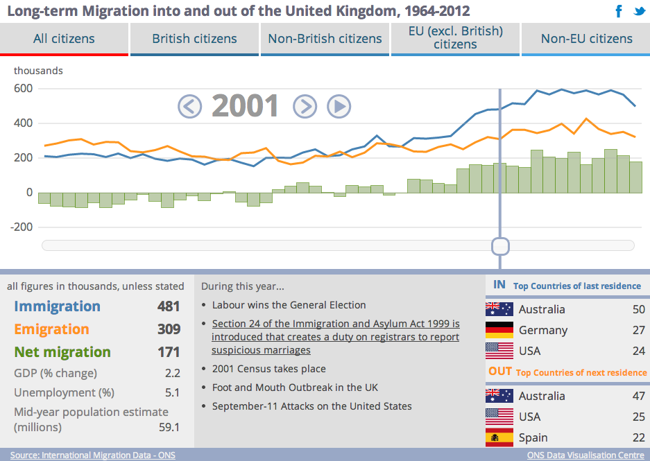
Animated bar and line chart showing long-term migration into and out of the United Kingdom between 1964-2012. Filters are used for different cohorts. Produced by the Office for National Statistics Data Visualisation Centre.
ONS Data Visualisation Centre view original
ONS Census map analysis – passports held
#3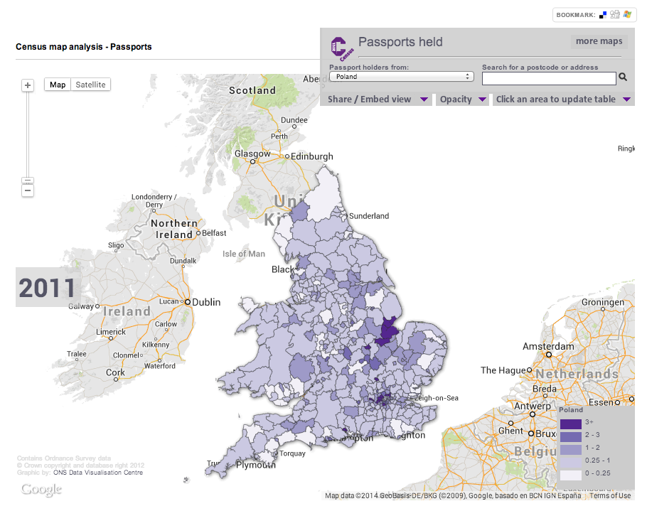
Interactive zoomable Choropleth map showing the percentage of residents in each council region who hold passports from different countries. Produced by the Office for National Statistics Data Visualisation Centre.
ONS Data Visualisation Centre view original
Map your moves
#2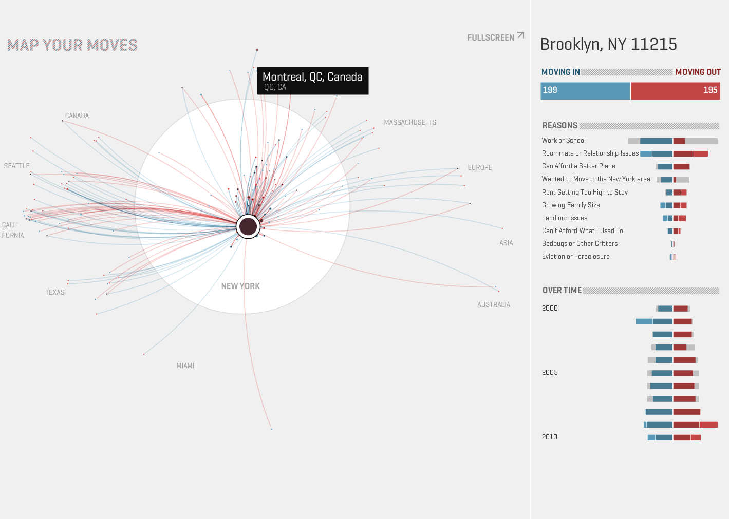
Interactive bubble plot/network map that provides a visual exploration of where New Yorkers moved in the last decade. The map distills more than 4000 moves from over 1700 people, collected in an informal survey by WNYC, a New York based public radio station, showing movements in and out of an area and reasons for the move.
Moritz Stefaner view original
The Global Flow of People
#1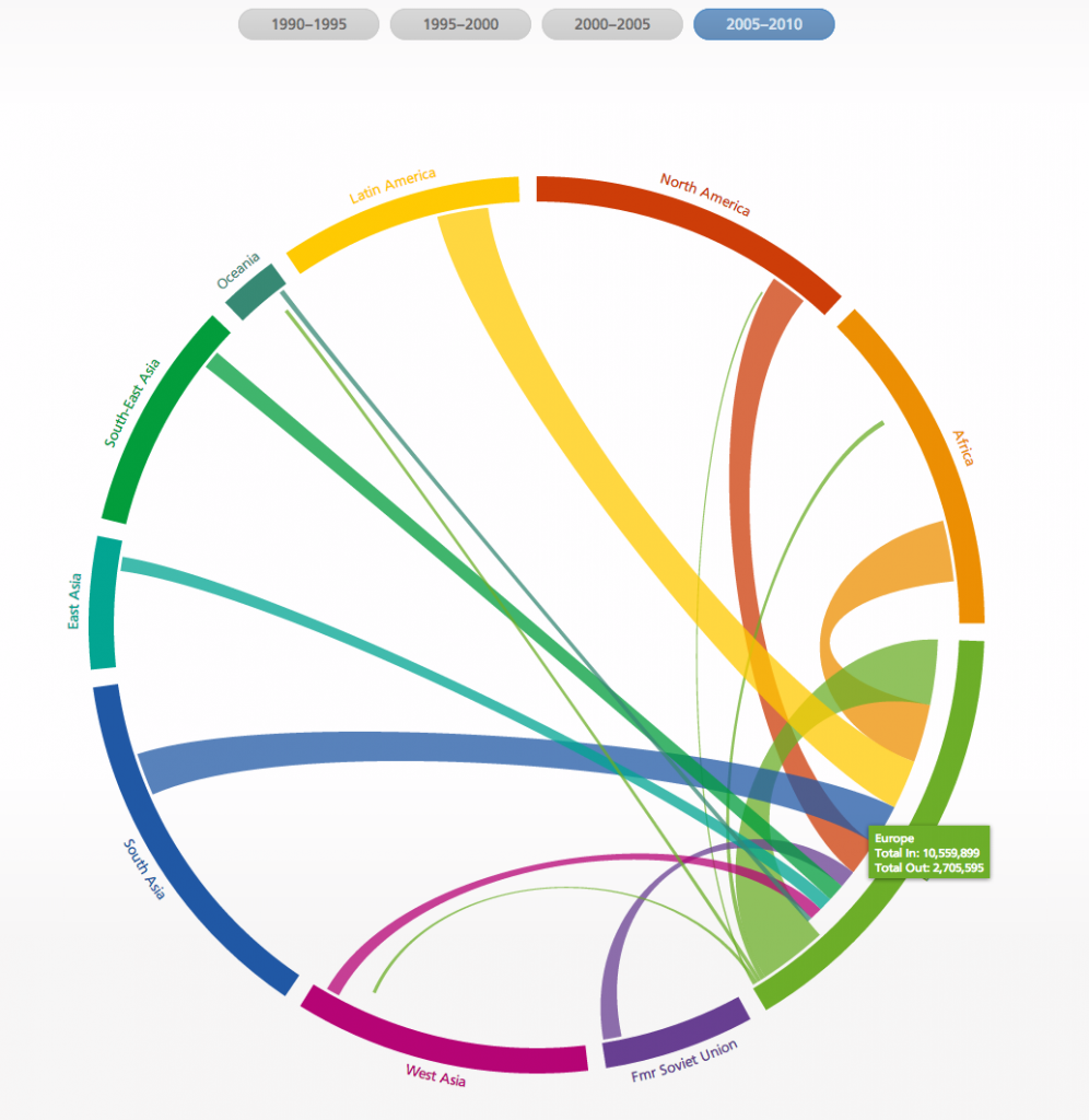
Interactive chord-diagram that shows estimates of migration flows between and within regions and countries for five-year periods, between 1990 and 2010.
Sander N, Abel G & Bauer R view original