Sharing the Facts? Data visualisation and the general election
I’ve been looking at the visualisations used by British political parties in the run up to today’s UK General Election on 7th May. Some parties use visualisations in their manifestos, some on their website, some don’t use them. What can a semiotic analysis of these visualisations tell us about how the parties want to present themselves? Surely data visualisations represent data and therefore facts? So how do they play a part in encouraging us to vote a particular way?

The Conservatives use a number of charts in the ‘Share the Facts’ section of their website. Already the visualisations and other details within the section are flagged up as being factual. Within the page, there are a lot of charts and red and blue primary colours feature heavily. As you might expect, anything in blue tends to refer to things that have happened during the time of the coalition government, whilst those in red refer to things under Labour. In this example with the title ‘1.8 million more people in work’ (seen here) that would at first seem fairly logical, except that the Conservatives have been in coalition with the Liberal Democrats – shouldn’t those blue bars be orange and blue striped? By omitting the orange, Conservatives are taking credit for coalition policy (and blaming Labour for unemployment figures during the economic crisis).
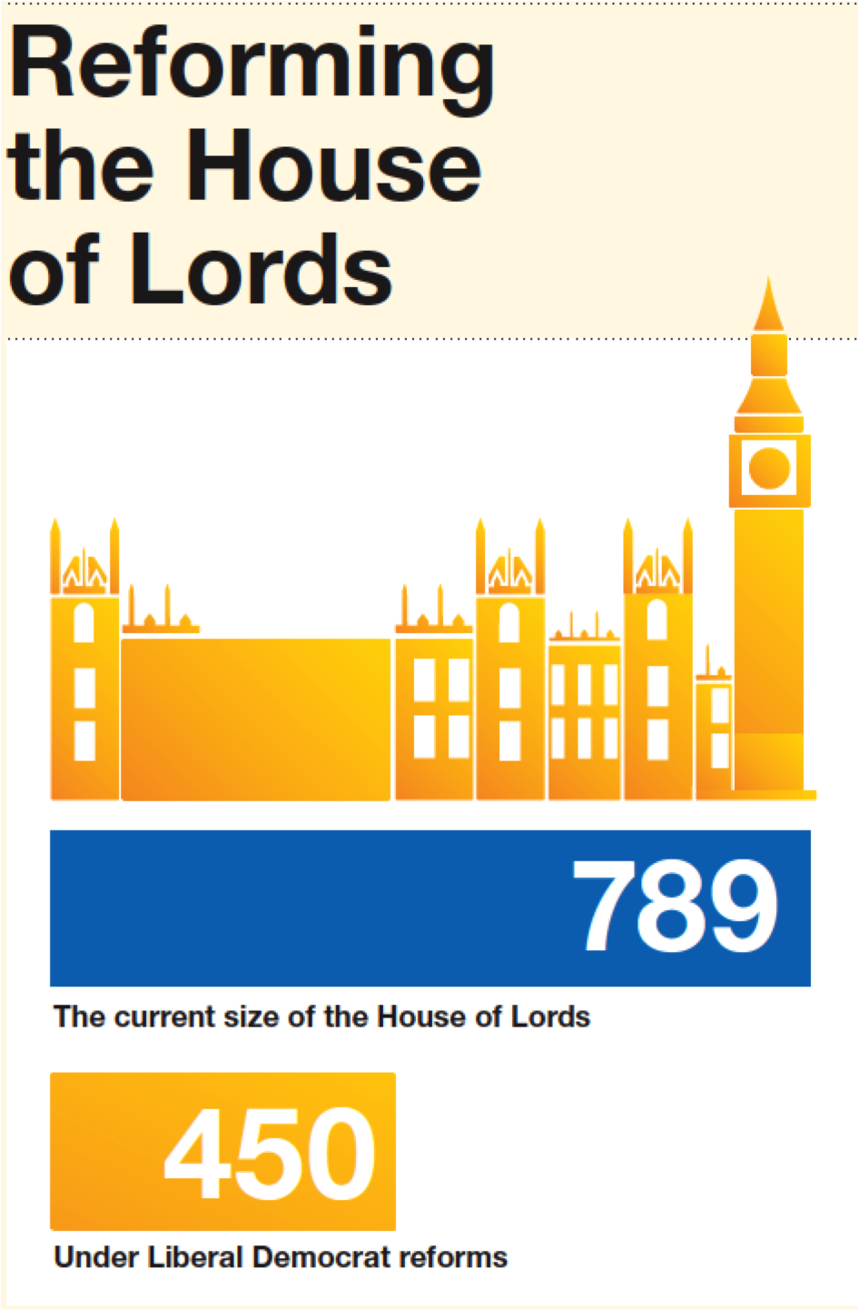
In their manifesto the Liberal Democrats employ a similar technique, colouring bar charts in orange and red, where orange refers to years under the coalition and red under Labour. They omit blue here, but do use it elsewhere, to represent the status quo. For example, ‘Reforming the House of Lords’ (page 136 of the manifesto) shows current number of MPs in the House of Lords in blue and proposed number under the Lib Dems in orange. Blue therefore represents what Lib Dems want to change: they are disassociating themselves from the status quo. The use of blue, connoting the Conservatives, is therefore a tactic to disassociate Liberal Democrats from their coalition overlords.
Significantly, despite Conservatives desire to ‘Share the Facts’, the visualisations on the website omit keys/legends, gridlines, precise labelling and in some cases any y axes at all. This makes it difficult to interpret the data on offer. They do, however, include data sources. Liberal Democrats don’t include data sources – so where has the data come from? We don’t know. But Lib Dems are better on including y axes and units. These key things in visualisations are vital components that are needed to be able to make sense of the data within the visualisations. Without them we can only make an impressionistic judgement about what message is being communicated.
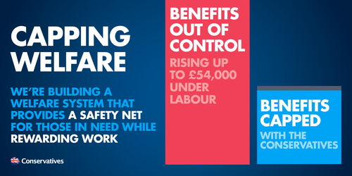
Much to my amusement the Conservatives’ ‘Capping Welfare’ (seen here) is not a data visualisation at all, but it uses the visual resources of one: two differently sized bars, one red and one blue, sit next to each other, each with text in white that tells the story of the bars (‘benefits out of control’ vs ‘benefits capped’). The visual choices here suggest we are dealing in data, which we are not.
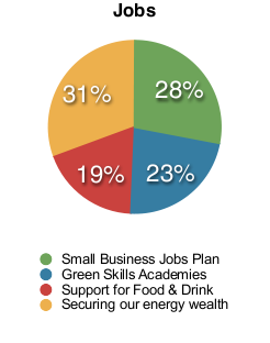
The only other party to use data visualisations is the SNP: visualisations appear in some policy sections of the website. Here the chart type of choice is pie charts. For example, a pie chart entitled ‘Jobs’ (seen here) is divided into four with percentage figures on each segment. Segments are coloured and there is a key. However, it’s unclear what the percentages relate to – is that what the SNP propose to do for jobs or what they have already done or is it something else? Only two of the segments (Small Business Jobs Plan and Green Skills Academies) have any link to the text beside the chart. Another pie chart, this time titled ‘Communities’ again has categories that don’t appear to be linked to the text, nor is there information about where the ‘data’ come from. It rather looks like these pie charts are being used to ‘pretty up’ the website and to suggest some sort of balanced approach – all the pie chart segments are loosely around a quarter. What is going on here? Have these charts been added to improve the appeal of the pages or are they actually drawing on some data, but doing a really bad job of explaining it?
None of the Northern Irish parties use data visualisations, nor do Plaid Cymru. Or the Greens or UKIP. Both the latter include tables of figures. Since the parties have a lot to gain in this election they need to show that they can be taken seriously. Publishing tables of figures (rather than vague charts as Tories, SNP and Lib Dems have done) is a way to establish themselves as in charge of the facts and serious contenders.
Labour does not use any data visualisations in its website or manifesto. Are they missing out in the data race? Are they aware of suspicions around statistics? The use of visualisations by three of the main parties in the UK tells us that visualisation is increasingly been seen as a powerful tool – but I don’t think any of these parties are doing a great job of making data transparent. If they want to convince people that they are trustworthy, then they need to work a lot harder on their visualisations.
Visualisations are very powerful because, as the Conservatives’ use of them highlights, they look like ‘facts’. Visualisations suggest ‘fact-ness’, or objectivity, and therefore are difficult to dispute. On Seeing Data, we have found that people need a range of skills to make sense of data visualisations, and that looking for some of the key elements of visualisations discussed here is an important first step. We also found that people need to exercise their critical thinking skills: these skills can help us to unpick what political parties are telling us, as shown in this blog post.