10 key terms in data visualisation
Want to be more informed about data visualisation, but unsure what some of the words mean? Here are definitions for 10 common terms that will help you understand data visualisations. Not all visualisations have all of these elements; that doesn’t make them ‘bad’ visualisations. Test yourself at the end!
Format
Interactive visualisations allow you to modify, manipulate and explore a computer-based display of data. The vast majority of interactive visualisations are found on websites but increasingly might also exist within apps on tablets and smartphones. By contrast, a static visualisation displays a single, non-interactive display of data, often with the aim for it to be viewed in print as well as on a screen.
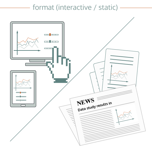
Chart type
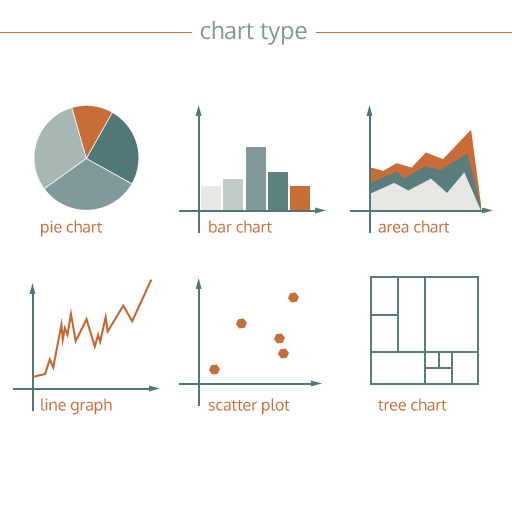
Charts are individual visual representations of data. There are many ways of representing your data, using different marks, shapes and layouts: these are all called types of charts. Some chart types you might be familiar with, such as the bar chart, pie chart or line chart, whilst others may be new to you, like the sankey diagram, tree map, choropleth map. See the section called ‘Taking time with visualisation’ for more on chart types.
Dataset
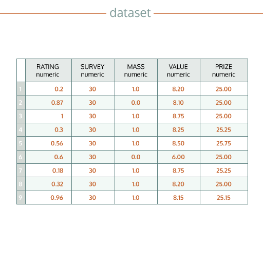
A dataset is a collection of data upon which a visualisation is based. It is useful to think of a dataset as taking the form of a table with rows and columns, usually existing in a spreadsheet or database. The rows are the records – instances of things – and the columns are the variables – details about the things. Datasets are visualised in order to ‘see’ the size, patterns and relationships that are otherwise hard to observe.
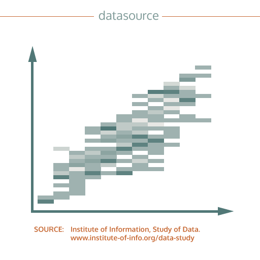
Data source
When visualisers want to show you where the data or information comes from, they will include it in the visualisation. Sometimes it appears near the title or the bottom of the page. Other times, if the visualisation comes with an article, you can find it in the accompanying text.
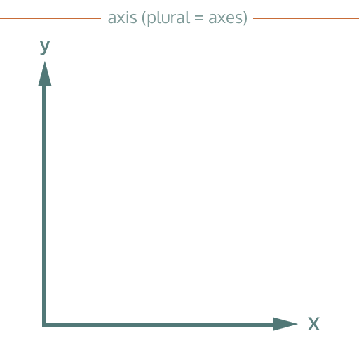
Axis
Many types of chart have axes. These are the lines that go up and down (the vertical Y axis), or left and right (the horizontal X axis), providing a reference for reading the height or position of data values. Axes are the place where you will usually see the scale (see below) providing a stable reference point against which you form your reading of the chart.
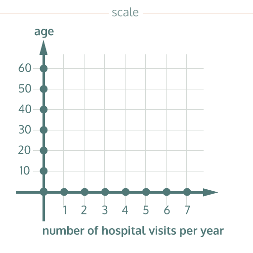
Scale
Scales are marks on a visualisation that tell you the range of values of data that is presented. Scales are often presented as intervals (10, 20, 30 etc.) and will represent units of measurement, such as prices, distances, years, or percentages.
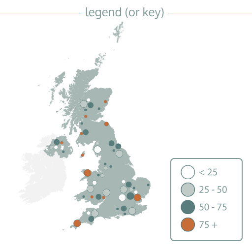
Legend
Many charts will use different visual properties such as colours, shapes or sizes to represent different values of data. A legend or key tells you what these associations mean and therefore helps you to read the meaning from the chart.
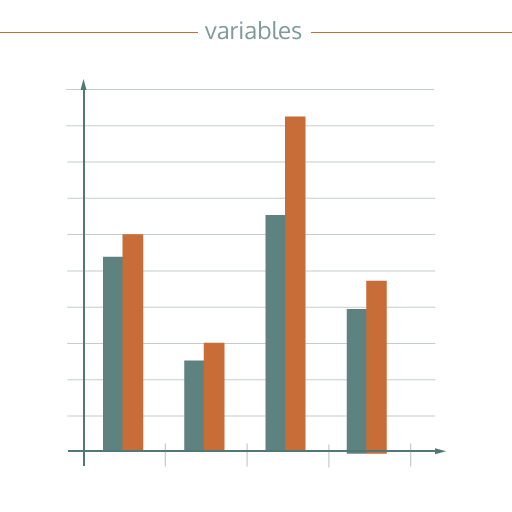
Variables
Variables are the different items of data held about a ‘thing’, for example it might be the name, date of birth, gender and salary of an employee. There are different types of variables, including quantitative (e.g. salary), categorical (e.g. gender), others are qualitative or text-based (e.g. name). A chart plots the relationship between different variables. For example, the bar chart to the right might show the number of staff (height of bar), by department (different clusters) broken down by gender (different colours).
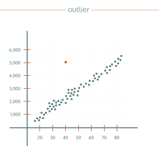
Outliers
Outliers are those points of data that are outside the normal range of data in some way. Visualisations can often help to identify patterns in the data – in the example on the right, the higher the number on the x axis, the greater the number on the y axis. Sometimes individual bits of data don’t fit in to the pattern, like the orange dot here; those are the outliers.
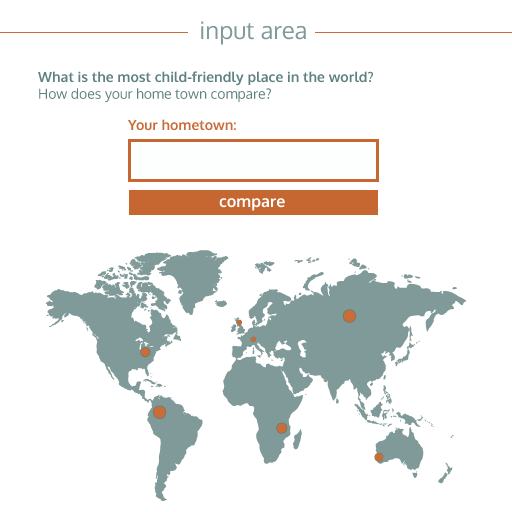
Input area
Input areas allow you to enter information into a visualisation, maybe to search for certain names or places, or to input information about yourself that will be used in the visualisation.