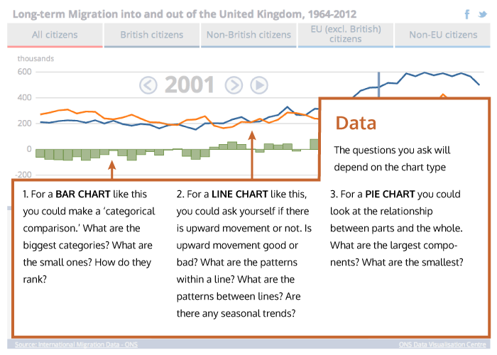
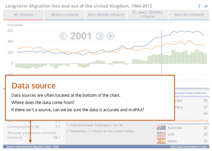
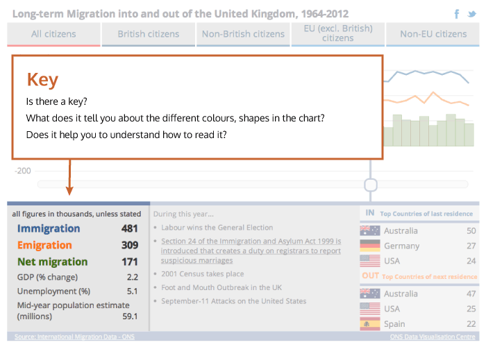
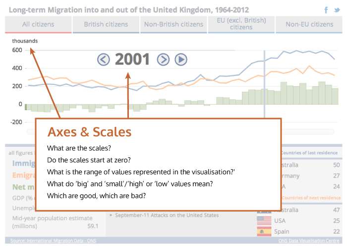
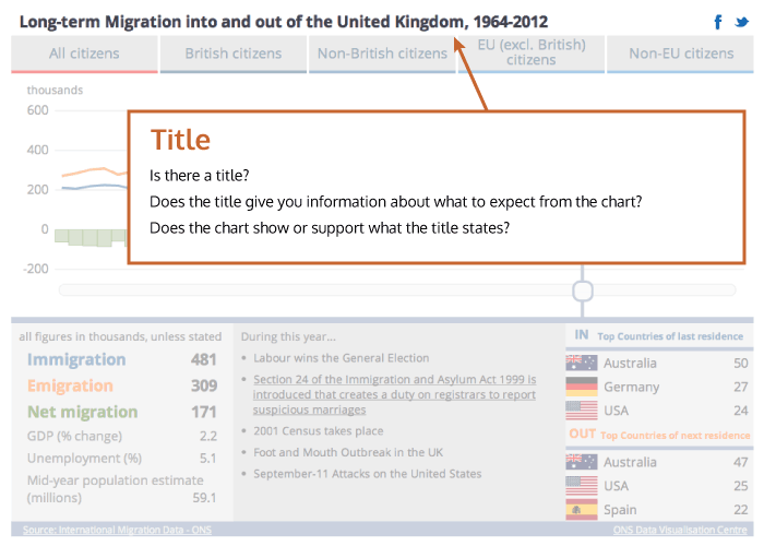
Top 5 things to look for (or visualisation in a hurry)
If you see an interesting visualisation but don’t have much time to look at it, check out five things to quickly help you make sense of it: title; axes & scales; key; data source; data. Not all visualisations have all these features; that doesn’t make them ‘bad’ visualisations. Some visualisations may not need them (for example, a world map doesn’t have a scale). Sometimes the features are present but not obvious – you may need to click on an icon to reveal them. But it may also be that without these features, a visualisation is more difficult to understand. Test yourself at the end!