Data visualisation and you
If you’re finding a particular visualisation difficult to understand, it might not be because of you or the visualisation. There are a number of factors that can affect how we interact with data visualisations. These include: the subject matter of a visualisation; the computing, statistical or mathematical skills you have; where the visualisation is located; and even how you are feeling on the day.
In this video, Seeing Data team member Rosemary Lucy Hill discusses the factors that can affect our engagement with a data visualisation.
Read transcript
On the Seeing Data project we researched how people interact with data visualisations. You can find out about the project on our website, seeingdata.org.
Here we discuss things that can affect a person’s engagement with a visualisation to help you understand that if you’re not getting on with a visualisation, it might not be because of you or the visualisation. There are a number of things that could be affecting you: it could be down to the visualisation itself; the computing, statistical or mathematical skills you have; the subject matter of a visualisation; where it is found; or even how you are feeling on that day.
To start with, let’s look at some examples:
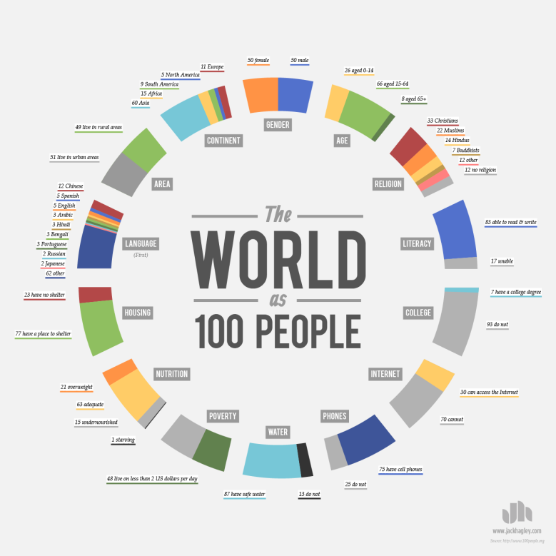
The World as a Hundred People (→)
(below) shows the people of the world as percentages, grouped by gender, age, and other factors, e.g. access to clean water.
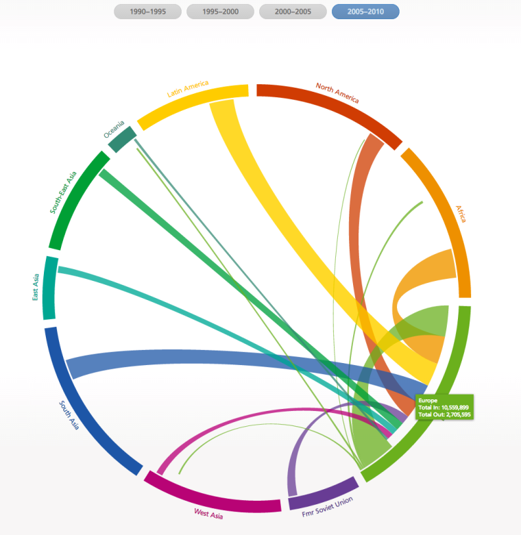
The Global Flow of People (→)
(below) shows migration around the world in an aesthetically appealing way.
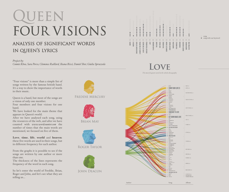
Queen: Four Visions (→)
(left) shows the lyrical themes in Queen songs, divided up by who wrote the song. You can see that Freddie Mercury wrote a lot about love.
At a glance, do you like some of these visualisations more than others? This could be for a number of reasons.
1. The subject matters
When you interact with a visualisation, you bring relevant information with you which helps you to make sense of it. If you’re not interested in the subject matter of a visualisation, don’t know a lot about it already and don’t want to know more, you’re unlikely to take the time to look at a visualisation about it.
But this isn’t always the case. For instance, you might find a visualisation visually intriguing and this might make you feel like exploring it further. This happened to Seeing Data team member Rosemary with Bumps, Bruises and Breaks (→), pictured below:
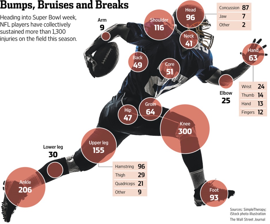
I’m not really interested in American Football, but the dynamic image of the footballer and the big red circles drew me in by getting me thinking about the impacts of sport on the body.
2. The source
The place that the visualisation was originally located is important when it comes to deciding whether to look carefully at a visualisation. We trust some sources more than others. For example, some participants in our research trusted visualisations which came from the University of Oxford, because they felt that their brand suggested quality and impartiality. Other participants trusted the newspapers they regularly read, and so trusted the visualisations in them. At the same time, some participants didn’t trust visualisations that appeared in newspapers that they did not trust, or rate as quality newspapers.
3. Beliefs and opinions
As suggested above, our research participants trusted visualisations that appeared in trusted publications, which fitted in with their worldviews. This tells us that people’s beliefs and opinions influence how and if they take time to engage with particular data visualisations.
Some participants liked visualisations that confirmed their beliefs and opinions. For instance, this visualisation (below) about media coverage of immigration (→) led some of our participants to reflect more deeply on what they already knew the media to be saying about migration.
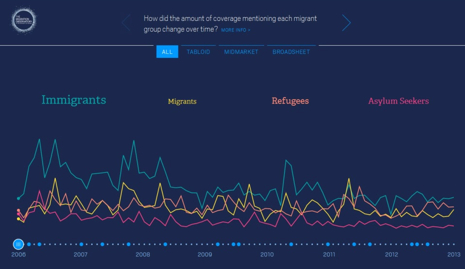
This suggests that some people might like, or be interested in, the data in visualisations that call into question existing beliefs, because it gives them something to think about. Either way, you bring your existing beliefs and opinions to bear on a visualisation, and they are likely to have an effect on how you approach it.
4. Time
Some visualisations represent quite complex data. Others have various layers and give you the option to dig deep into the data, like this one of about the quality of life in different parts of the world (→), pictured below:
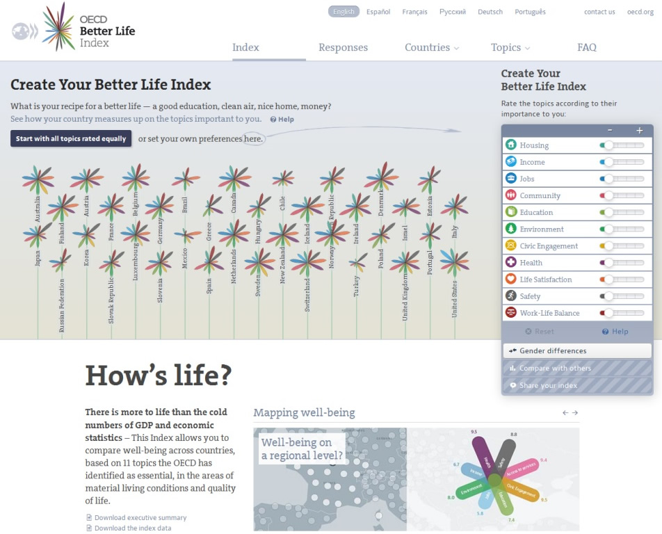
 Some include links to the data source, allowing you to check that the visualisation is faithful to the data, as long as you can make sense of the ‘raw’ data!
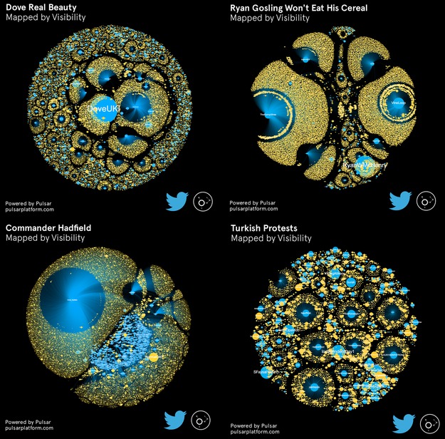
Some use visual metaphors that can be tricky to work out, such as this network map of how the video of Commander Hadfield playing Space Oddity spread around Twitter (→), pictured on the right.
Making sense of data visualisations can take time, and being able to engage with them depends on the time you have. Engaging with visualisations can feel like work for people who are not used to looking at them. On the research project, we found that busy people found it hard to make time for thinking about a data visualisation or find the energy to do this work. As one of our participants said:
It was all these circles and colours and I thought that looks like a bit of hard work; don’t know if I understand.
When time was set aside to engage with visualisations, such as in the focus groups that we ran, most of our participants enjoyed looking at them, and were disappointed when the time came to an end.
5. Emotions
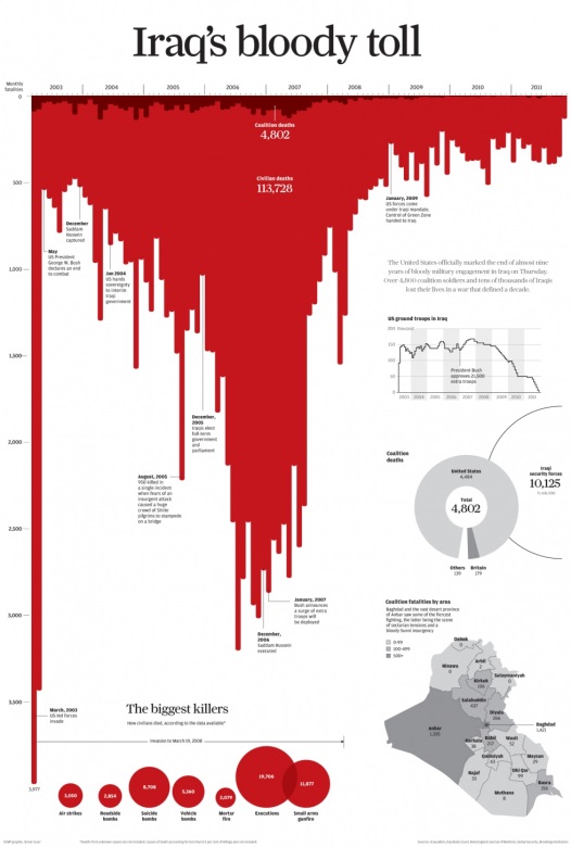 The first impressions that you have when you glance at a visualisation are important in determining whether you decide to spend time looking and interrogating the data. You might have strong emotions relating to the subject matter, visual style, or other factors. This visualisation of death rates in the Iraq war (→) , shown on the right, is powerful because of the choice to use blood red and to turn the bar chart upside down, giving a dripping effect.
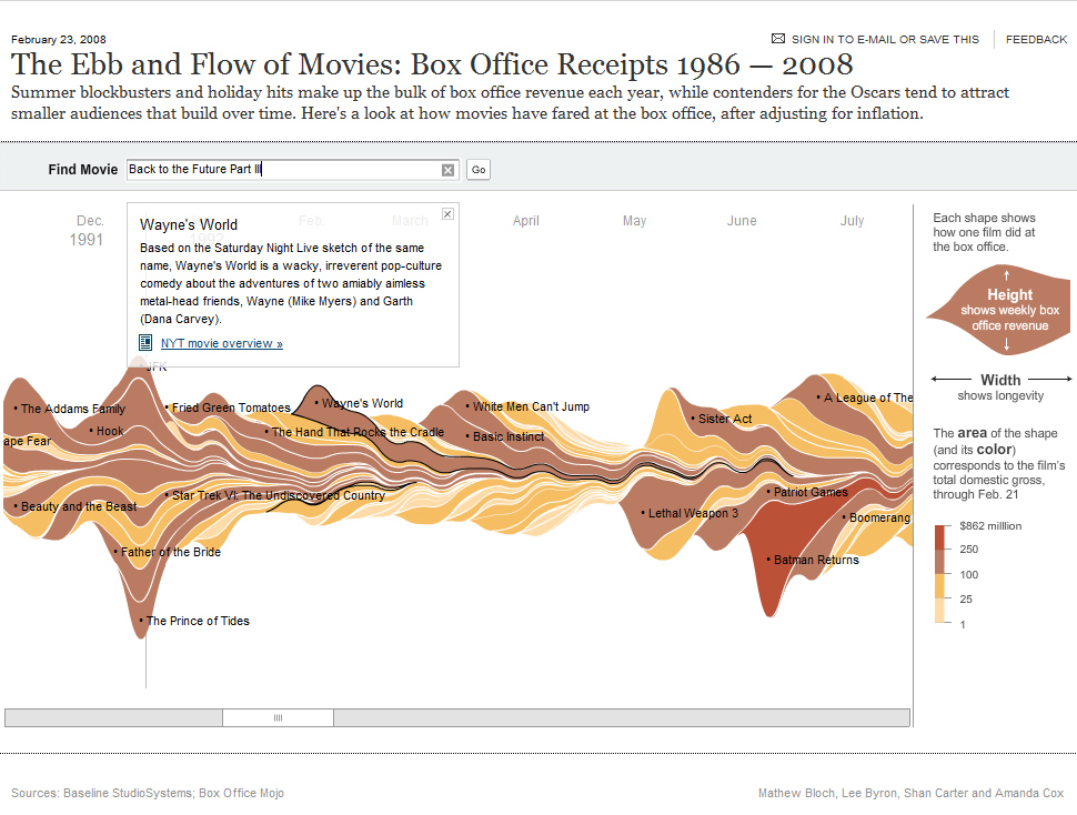
In our research, we found that some participants felt immediately confused when they first looked at some visualisations, and this put them off exploring further. But sometimes, they were drawn in by the visual style. This happened for a few participants in relation to this intriguing visualisation of film box office receipts (→), see following page.
It’s useful to be aware of the way emotions can affect your reading of a visualisation, as it might help you to overcome initial emotional responses which could put you off exploring further. For example, one research participant said that acknowledging how she felt about the visualisations first, before moving on to what she thought about them was a useful step.
6. Confidence
You need to feel confident in your ability to engage with and make sense of visualisations. Confidence often depends on your sense of whether you have the right skills. People who make visualisations sometimes say that people looking at them don’t need any skills to do this; they think it’s down to them, the designers, to make good visualisations. But in our research, we found that people need a broad range of skills. These can include language skills (you need to speak the language in which any text is written in order to make sense of it); mathematical or statistical skills, such as the ability to make sense of a particular chart type; and critical thinking skills, such as asking yourself what has been left out, or what point of view is being prioritised.
But you don’t need to be an expert in any of these things: sometimes just a bit of skill is enough.
Visualisation credits
- ‘The World as 100 People’ by Jack Hagley —
jackhagley.com/The-World-as-100-People (→) - ‘The Global Flow of People’ by Nikola Sander, Guy J. Abel & Ramon Bauer —
global-migration.info (→) - ‘Queen: Four Visions’ by Connie Khoo, Sara Porco, Clemence Raillard, Ileana Ricci, Daniel
Sher, Giulia Spruzzola —
visualizing.org/visualizations/queen-four-visions (→) - ‘Prise de Pouvoir Sur Le Tour 20 Ans D’étapes Clés’ by Vistadium —
vistadium.com/2012/06/29/tour-de-france-20-ans-de-conquete-du-maillot-jaune (→) - ‘Bumps, Bruises and Breaks’ by the Wall Street Journal —
wsj.com/news/interactive (→) - ‘Migration in the News’ by Clever Franke for the Migration Observatory —
sd-census.cleverfranke-dev.com (→) - ‘Non-UK Born Census Populations 1951 – 2011′ by ONS —
ons.gov.uk/ons/rel/census/2011-census-analysis (→) - ‘Better Life Index’ by OECD —
oecdbetterlifeindex.org (→) - ‘How Videos Go Viral on Twitter’ by Pulsar —
pulsarplatform.com (→) - ‘Iraq’s Bloody Toll’ by Simon Scarr for the South China Post —
scmp.com/infographics/article/1284683/iraqs-bloody-toll (→) - ‘The Ebb and Flow of Movies: Box Office Receipts 1986 — 2008′ by Mathew Bloch, Lee Byron, Shan Carter and Amanda Cox for the New York Times —
nytimes.com/interactive/2008/02/23 (→)