Home » Seeing Data Blog » Page 2
Seeing Data Blog
by Helen Kennedy
• May, 6th 2015
On the Seeing Data project we have generated a lot of data for qualitative analysis: we have focus group and interview transcripts; written diaries; talking mat representations of how much people liked and learned from visualisations; semiotic coding of visualisations. Lots of very rich data which we are busy analysing. One thing that has becomecontinue reading »
by Helen Kennedy
• April, 23rd 2015
Over the past couple of months, we’ve been drawing on our emergent findings to engage with different groups. In February, Rosey and Andy worked with secondary school-aged students in Leeds as part of the Jampacked events which introduces them to computing and programming. Later, in March we developed that into fuller, two-hour workshops for researchers atcontinue reading »
by Helen Kennedy
• April, 11th 2015
It’s been a long time since our last project blog! Since November, we have been finalizing our field research with users, designing Phase 2 of our project website – which incorporates a large section dedicated to helping users develop their visualisation literacy – and starting to think about what we have found out oncontinue reading »
by Helen Kennedy
• November, 4th 2014
Over the last couple of months Will Allen and I have been going around the country talking to various groups of people about their encounters with data visualisations (conducting focus groups). Some of the people we’ve spoken to have been particularly interested in data and data visualisation, but a lot of people have not: theycontinue reading »
by Helen Kennedy
• October, 8th 2014
As has been explained, the focus of our research study is towards understanding the visualisation literacy of ‘everyday’ people and their inherent capability to read, understand and get the most out of data visualisations: What difficulties do they encounter? What type of visualisation do they find easier to work with? How intuitive do they findcontinue reading »
by Helen Kennedy
• September, 16th 2014
As part of our endeavor to understand how people make sense of visualisations, we are interested in how the producers of visualisations perceive their end users. Assumptions about what makes an effective visualization and about how end users interact with visualisations inform how visualisations get made, which in turn informs how people interact with them.continue reading »
by Helen Kennedy
• August, 19th 2014
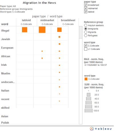
Yesterday, a PhD student and I launched a new report with the Migration Observatory that analysed the language used by the UK national press to talk about Bulgarians and Romanians since December 2012. Textual analysis, as well as the visual representation of that analysis, is a topic that has really captured my interest because ofcontinue reading »
by Helen Kennedy
• August, 13th 2014

This is a very exciting week for all of us on the Seeing Data team: we will finally begin to hear some responses to visualisations from members of the public. On Wednesday we will conduct our pilot focus group. A small number of individuals have been keeping diaries of the visualisations they have seen overcontinue reading »
by Helen Kennedy
• August, 10th 2014

The challenge of enhancing visualisation literacy is not just concerned with being able to comprehend a wider variety of charts and graphs. It is also about having greater sophistication to recognise what outcomes certain visualisations are attempting to accomplish and indeed what they are capable of accomplishing. We will soon be undertaking a series ofcontinue reading »
by Helen Kennedy
• July, 29th 2014
The ordinary citizen ought to be able to get information freely about all subjects in which he is interested, just as he can get geographical knowledge from maps and atlases. There is no field where humanisation of knowledge through the eye is not possible“ (Neurath, O. 1939: 3). We are in the midst of acontinue reading »