How a visualisation is made
A number of decisions and processes go into making data visualisations. The decisions and processes relate to how to gather and represent the data, and involve asking questions like who will the audience be and where will the visualisation be shown and seen? Understanding these processes is important because it can affect how you engage with a visualisation.
In this video, Seeing Data team members Helen Kennedy and Andy Kirk talk about how a visualisation is made.
Read transcript
On Seeing Data, we researched how people interact with data visualisations. You can find out about the project on our website, seeingdata.org. Here, I’m going to talk about how a visualisation is made, because this can affect how you engage with a visualisation.
A number of decisions and processes go into making visualisations. These involve a range of people, including the people who want the visualisation to be made, the people making it, and other people in between.
These decisions and processes relate to how to gather and represent the data, and other things too, like who the audience will be, and where the visualisation will be shown and seen.
Gathering data
First, let’s talk about gathering data.
The data on which visualisations are based are gathered in particular conditions. What ends up in a dataset depends on things like what kind of data can be accessed, what tools are used to gather them, and who is doing the data-gathering.
Who is gathering the data matters because, as many writers have pointed out, gathering data involves interpretation (for example about what counts as good or relevant data), so the subjective assumptions of the data-gatherer play a role in the data-gathering process.
What data are gathered for also matters.
Data are often gathered to answer particular questions, or in response to certain curiosities. This means I might gather data from this particular source but not from that source, because I don’t think those data are relevant to the questions I want to answer.
Some writers argue that the term ‘raw data’ implies that data are objective, truthful and factual. But we can see that this isn’t the case; data come into being in particular situations, which shape what they are like.
Geoffrey Bowker, an expert on how knowledge gets produced, plays on the notion of ‘raw data’ to try to explain how data come into being. He says that data are not raw, but rather are, or should be, ‘cooked with care’.
Representing data
Then, there is the stage of representing data.
Who wants the visualisation to be made, and what for?
These questions influence what kind of visualisation we get to see, and what ends up being made.
The visualisation designer needs to think about the following things:
- who is commissioning the visualisation, that is, who wants the visualisation to be made and what requirements do they have?
- who is the audience; what do they want or need to know? What do they already know about the subject matter? Are they already interested in the subject?
- where will the visualisation be published; is it for the web, a presentation, or for a
printed report?
Designers’ decisions
Once data have been collected and it is clear who wants the visualisation and what they want it for, further decisions have to be taken by the person producing the visualisation.
This means asking questions about the analysis and the visualisation of the data:
- what story is emerging from the data?
- Is there enough data, or do more need to be collected?
- which elements of the data should be presented?
- what is the most appropriate chart type?
- what units and scales should be used?
- what colours, fonts, shapes, and layout would work best?
- should it be interactive or static, and how should interactivity work?
- should explanatory or instructional text be included? What should it say?
- should narrative accompany the visualisation, to help tell the story?
- how much information, if any, should be included about the data and the creation of
the visualisation?
How designers answer these questions has an impact on the visualisation that we eventually get to see.
Designers base their decisions on a range of different things.
Many visualisation designers have studied and learnt about best practices in visual design and data handling. They keep up-to-date with best practice by reading blogs, going to visualisation conferences and talking to other experts in the field.
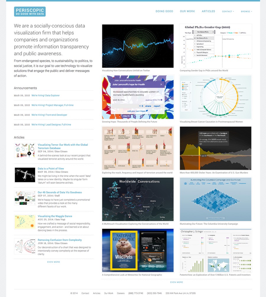
All of the visualisation professionals who we interviewed on our Seeing Data project are committed to ‘doing good with data’. That’s the motto of this US-based visualisation agency Periscopic. This means making it easy for people to understand data by visualising them.
But even though designers are committed to doing good with data, the processes and questions that I’ve mentioned so far mean that they can’t present us with a neutral window onto data.
Intermediaries
Designers who we interviewed as part of our research talked about the role that intermediaries, people ‘in between’ the person making the visualisation and the person commissioning it, play in shaping a visualisation.
Intermediaries can include newspaper editors or the people in legal departments of the organisations commissioning the visualisations.
These people make sure that everything published in the name of their organisation, including data visualisations, is in keeping with the perspective, style and tone of voice of the organisation. If visualisers want to get paid, they need to adhere to guidelines! And this can affect which visualisation gets made too.
Like the idea of raw data, visualisations can appear to be objective or truthful.
Some of the conventions for displaying data play a role in creating this impression. For example, it’s common for visualisations to use two-dimensional viewpoints, such as a front-on view (like graphs that use an x/y axis), or a top-down view (like maps and pie charts).
Two experts on visual communication, Kress and van Leeuwen, argue that using a fronton or top-down view hides the perspective behind the visualisation. This means that ‘distortions that usually come with perspective’ are ‘neutralised’: although these views look objective, they disguise the perspective that lies behind them.
The fact that many of us are unaware of the decisions that have been made in producing a visualisation, and the role of intermediaries, can strengthen this feeling that visualisations are ‘factual’.
This is true of other types of media or things that are designed. A news story, for example, is the result of similar decision-making, and is influenced by who is telling the story, to whom, and in which context.
Most designers would agree that this is the case. In our interviews, visualisation designers acknowledged that when making a visualisation, they make decisions about what not to show as well as what to show. They also said that people looking at visualisations need to look critically and question what is shown to them.
They should not simply trust visualisations because they are based on numbers (and therefore appear factual, or truthful).
So the visualisations that we see in our newspapers, on TV, on social media and elsewhere are the result of a long process. A lot of thinking and decision-making lies behind a visualisation!