Taking time with visualisation
Format & task size
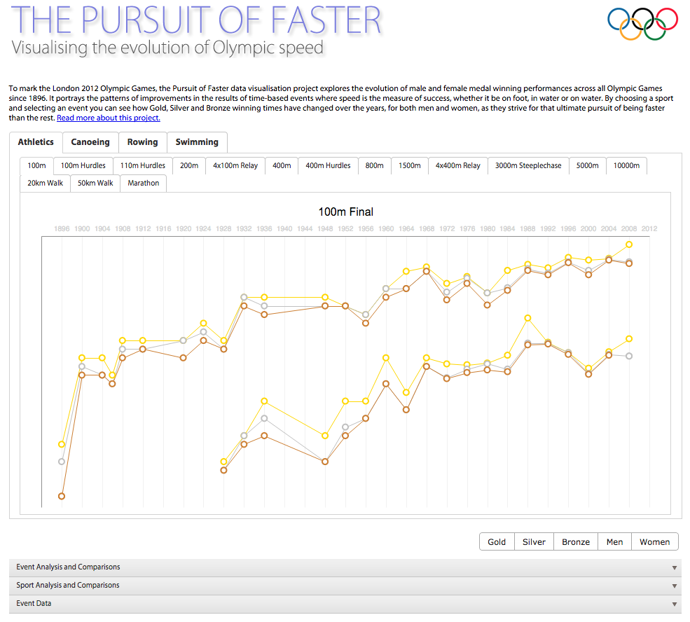
First ask yourself, how big a task does reading this visualisation feel like it will be?
- If it is a static visualisation, how large and varied is the content? Is it a dense display with lots of charts and text, or quite a small and compact one?
- If it is interactive, how much interactivity is there? Are there many buttons, menus, options etc.?
- If the visualisation doesn’t fit on your screen, how much more scrolling or how many different pages will you have to look through to see the whole thing?
This initial thinking helps you establish how much effort you will need to put in to thoroughly explore the visualisation. Looking at the first page of ‘The Pursuit of Faster’, the chart doesn’t look overly complicated and the visualisation all seems to fit onto the screen without the need for scrolling. But there are a number of different tabs, interactive options and collapsible content areas lurking around the edges of the chart – ‘The Pursuit of Faster’ could be more involving than it initially seems.