Taking time with visualisation
Interactive features
Interactive visualisations (usually hosted on the web or in an app) aim to provide a range of features to enable you to explore the data. These might include filters to include/exclude certain values or a menu to select which category to view.
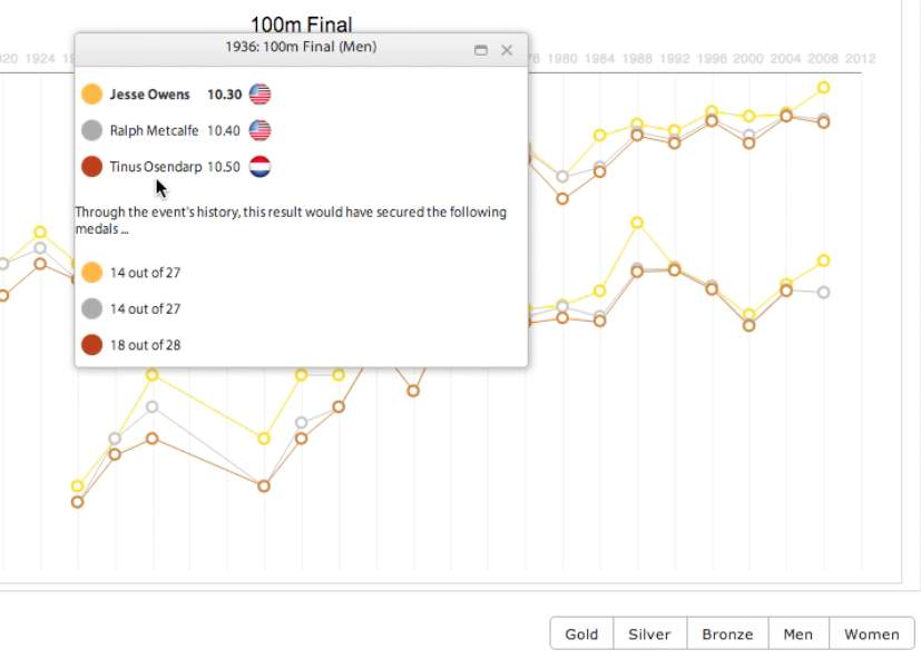
Sometimes interactive features are included without being visible on the surface, perhaps because the designer feels that users will expect certain interactive capabilities, but they don’t need to be conspicuous. For example, rather than show all value labels on a bar chart, hovering over the bars opens a pop up that reveals the value. There may be no instructions to tell you to do this, but you might expect it to based on past experience.
Always explore the visualisation to get a feel for the different ways you can interact with it.
In ‘The Pursuit of Faster’ there are a number of interactive options. At the top you can choose a sport and specific event and then the results will be plotted in the chart area below. You can then filter for male/female and gold, silver or bronze medals. Hovering over a marker on the chart reveals the specific time value. Clicking on the marker shows the full race results and a bit more information. Finally, the collapsible sections at the bottom reveal more detailed analysis of the selected event.