Taking time with visualisation
Pie chart
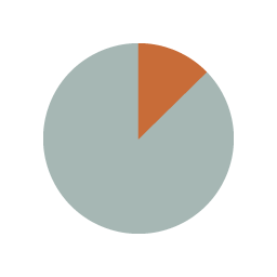
What it shows
A pie chart uses a circular display with the segments representing different categories. Pie charts show a part-to-whole relationship – in other words what % of the total is made up by different categories. A pie chart might be used, for example, to show the percentage of actors with different nationalities in a specific film.
How to read it
Determine the percentage value of each category by looking at the angle of the segment and the area of the segment overall (this isn’t always easy, particularly if there are many segments within a single pie chart). Then compare the sizes of the segments to see the makeup of the ‘whole’ and the ranking of each category within the whole.
Things to beware
Check that all of the values add up to exactly 100% – if it is more or less then the pie chart is flawed.
Alternative
Sometimes you see a pie chart with a hole in the centre (often to accommodate a label). These are called doughnut charts. They function in the same way as pie charts, except without allowing you to judge the angle of each segment at the centre.