Taking time with visualisation
Choropleth map
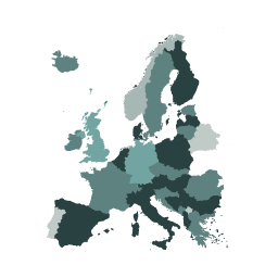
What it shows
A choropleth map uses colour coding to indicate quantitative values across geographical areas on a map. Typically the colour scale will be darker for large values and lighter for small values. A choropleth map might be used to show the percentage of people who are unemployed by region, with a darker colour indicating that more people are unemployed.
How to read it
First read the instructions and colour legend/key to understand what the shading means. Look for the regions with the largest value shades, then look for the lighter colours to see the low values. Look out for any significant regional patterns – maybe neighbouring areas are a similar shade or are very different.
Things to beware
Just because a regional area is large, doesn’t mean to say the coloured statistic is of more importance than that of a smaller regional area. The larger area’s statistic may be related to the people in the area rather than the area itself – so beware of size distorting your interpretation. Take a close look at the colour value bands in the legend to ensure that the groupings of values by shade are logical.
The Earth is a sphere, but when it comes to viewing a 2D flat map there are many different ways that the world can be represented. These are known as map projections. Be aware that some map projections can distort the size of regions of the world and might make some areas look larger or smaller than they really are.