Taking time with visualisation
Symbol map
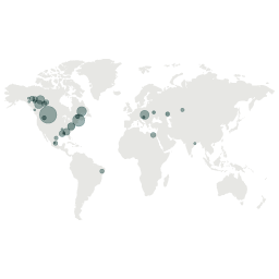
What it shows
A proportional symbol map shows a marker (often a circle) positioned on a map. The marker is sized according to a quantitative value. This type of map might be used to show the number of earthquakes in certain regions around the world.
How to read it
Look for the large values and the clusters of larger values. Also note where there are no large markers, or no markers at all. Sometimes colour might be used to show different groups of values so look out for these groupings and see what patterns they make.
Things to beware
The size of a large circle can make it harder to locate its exact position on the map. Also, larger shapes might overlap or even hide neighbouring circles as a result of their size.
Alternative
Dot maps look similar to choropleth maps, but on a dot map the markers are not sized, rather the dots represent an instance of something. A dot map might be used to plot the location of every museum in a country.