Taking time with visualisation
Stream Graph
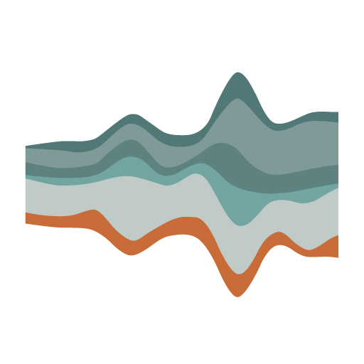
What it shows
Stream graphs are not used as much as other chart types, but they are worth explaining as they are quite different. They are often used to show changes of different categories over time when there are many categories AND these categories start and stop at different times. The height of each individual stream shape shows how the value of that stream has changed over time. The length of the stream shape shows its duration. Colours are often used to either show more detail about that category’s quantitative value (on a sliding scale of shades) or to differentiate between different categories.
Stream graphs might be used to show how much money films have made when those films have not been released at exactly the same time. This would tell us something about the seasonality of cinema going.
How to read it
Look out for the the peaks and the shallow periods for the total values over time. Look at the overall shape of the stream to see if there are seasonal patterns. Pick out the colours and look for peaks and troughs to identify patterns or outliers.
Things to beware
The vertical dimension of a stream graph does not mean positive or negative; it is purely concerned with the best stacking arrangement. Don’t try to read the values of the height of a slice at a given point, focus instead on the bigger picture.