Taking time with visualisation
Slope graph
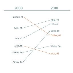
What it shows
A slope graph can be used to show a ‘before and after’ story of different values, based on comparing their values at different points in time. The related values are connected by slopes. It might be used to show change in food and drink prices between two years, as in this example on the right.
How to read it
Look at the ranking order of the values on the left to get a sense of the gaps and the clusters. Then observe the connecting lines between the related values. Which have gone up, down or stayed the same? Focus on the big picture before diving into more detailed interpretations. Even if all or no values have altered dramatically, that too could be an important finding. Sometimes colours are used to accentuate changes up or down.
Things to beware
If a lot of category values are presented slope graphs can become quite busy, especially if there are bunches of similar values and slopes. On these occasions interactive slope graphs, where certain values can be filtered out, make the graph easier to read.
Alternative
Rather than showing a before-and-after story, some slope graphs show the relationship between categories across two very different quantitative values. For example, a slope graph might show on one side the total Olympic medal counts for countries and on the other side the country populations. Country values are connected to see if any countries are ‘punching above their weight’ or not performing as well as might be expected.