Taking time with visualisation
Scatter plot
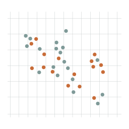
What it shows
A scatter plot shows the relationship between two sets of quantitative values. All values are plotted on the chart, depending on their respective positions along both the x and y axes. The plotted points invite observations about the kind of relationship between the two variables. For example, a scatter plot might show film profits on the x axis and number of awards on the y axis. You could then see whether profitable films are award-winning films.
How to read it
Look out for clusters of points and also for the gaps without points, which can be just as revealing. Some of the most interesting observations come from outliers – individual points that are noticeably different to others in their position. Sometimes different colours or shapes provide further information by showing how some points are associated.
Things to beware
Notice the start and end values along each axis. They don’t always have to start at zero so if they don’t, think about how it effects the relationship between the points. Scatterplots are much easier to read if the chart is a square layout.