Taking time with visualisation
Stacked bar chart
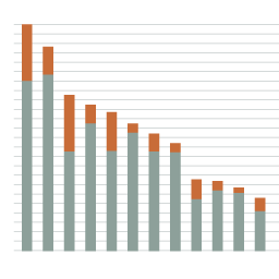
What it shows
Like the bar chart, a stacked bar chart uses the length of two or more stacked bars to represent the components of a total quantitative value across a range of different categorical values. You might use it to show the number of male and female actors in a range of different movies, visually separating the gender bars using colour.
How to read it
As with an unstacked bar chart, judge the absolute length of each bar by cross-referencing against the scale along an axis or a value label. Use the grid lines to compare the parts of the stack against one another. Compare all the bars and stacks by looking for the big and the small, the unusual and the normal to get a sense of the significance of each component.
Things to beware
Whilst you will find it easy to judge the lengths of the bottom coloured bars on the baseline, the start of the stacked bars will rarely begin from the same point across the chart. This makes comparisons between components across all categories a little trickier.