Taking time with visualisation
Tree map
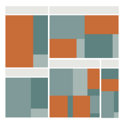
What it shows
A treemap is used to show the composition of a whole when there are many components. The arrangement is typically (but not always) a rectangular area divided up into smaller rectangles to represent sub-categories. The size of these sub-category rectangles represents a quantitative value. Usually, the small rectangles are logically grouped into some further categorical family and are coloured to indicate a key attribute of the data. Whilst a pie chart might best work with 3 or fewer segments, a treemap works well with many. You might use a tree map to show the makeup of the top 500 companies on the stock exchange, with each stock displayed as a rectangle sized by its value and coloured by its daily change.
How to read it
Seek out the largest rectangular values (or the largest collected group of rectangles) and look out for significant colour variations. Effective labeling becomes difficult as the rectangles get smaller so often only the most prominent values might be labelled. It is common to find treemaps as interactive visualisations enabling you to click or hover over the different shapes to bring up more details about the category.
Things to beware
A treemap is only valid if the constituent units are legitimately part of the same ‘whole’.